

2018 School Spending Survey Report
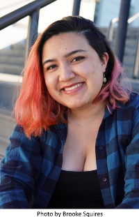
Five questions for Talia Dutton
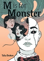
M Is for Monster (Surely/Abrams ComicArts, 14 years and up) by Talia Dutton is a comic-format, gothic, sci-fi, horror story about family and identity that takes for granted that people should identify their pronouns, and is published by a new queer graphic-novel imprint (curated by Mariko Tamaki). Happy Pride!
M Is for Monster (Surely/Abrams ComicArts, 14 years and up) by Talia Dutton is a comic-format, gothic, sci-fi, horror story about family and identity that takes for granted that people should identify their pronouns, and is published by a new queer graphic-novel imprint (curated by Mariko Tamaki). Happy Pride!
1. Why is Surely a good home for your YA debut?
 Talia Dutton: The whole idea of Surely is showcasing the stories that queer creators want to tell. It doesn’t dictate what those stories need to be, which was perfect for me because my story was still wildly in flux when I first started the pitch process. Curator Mariko Tamaki asked me if I was interested in pitching a story when I was still a grad student. All I really had that was anything was my thesis — which looked nothing like the final product. So having an imprint that just wanted to see what story I had to tell because I was me was perfect. Besides, part of my approach to queer stories is based on the fact that sometimes I don’t want the story to be about being queer. I just want it to be a fact of the characters, just like it’s a fact of me. Sometimes I think that being bi is a less important part of who I am than, say, the fact that I like video games or have a nut allergy; it just doesn’t come up very often. Now I realize that this is coming from a place of privilege — of having very accepting parents and growing up in a very liberal part of LA. There’s nothing wrong with a story about coming to terms with being queer, but there are a lot of those stories. Sometimes I just want science fiction where being queer is less weird than being a re-animated corpse! And Surely not only let me do that, but encouraged it.
2. Are you a horror fan (and/or a Frankenstein fan)?
TD: Oddly enough, no to both questions! I’m not a Frankenstein fan. I respect its place in the formation of science fiction, but to be completely honest, M Is for Monster is based more on the popular mythos of the Frankenstein story than the actual book. I love the concepts behind horror — these ideas of societal and personal ills bubbling up to the surface in physical forms but forcing the audience to contemplate where those ideas come from and what real monstrosity means; I totally nerd out over that. But I am, and always have been, a huge scaredy-cat. When I was little the only movie I could watch without being terrified of the villain was Disney’s Cinderella — and even then I had to skip all the scenes with the mean cat. I still can’t watch horror; I hate both not knowing what’s coming and knowing that it’s definitely going to be some kind of scare. I don’t even consider myself much of a horror creator. I just love monsters, and I think the kind of stories that work for YA lend themselves well to the heightened emotions and drama of horror because YA stories are really condensed windows into the emotions of growing up. But it’s also one of those instances where the tastes of the creator and the taste of the audience don’t need to line up. Because I never have to experience this as a reader — I wrote this tension, so I’ll never have to worry about not knowing what’s coming!
 3. Do you have interests or experiences in common with M or Maura, neither, or both?
TD: In this case, yes to both questions! I feel like all of my characters are a little bit of me, just different pieces. I’ve always been very analytical for an artist. I really like organizing and categorizing things in a very scientific way — which even affects how I like to approach art by taking things step by step and piece by piece. I think this is very Maura — and very Frances as well. I honestly think that Maura didn’t really have the chance to figure out who she was outside of her life with Frances [her sister], which is one of the true tragedies of the story. When you want to impress someone you look up to, you learn what parts of you to focus on and put out there. Maura is like me in a way that I’m learning to grow beyond. For example, when I was little, I learned that adults loved when I said broccoli was my favorite food. It wasn’t. I didn’t dislike broccoli — but saying it was my favorite was just to impress my aunts and uncles. As for M, her love of sewing and fashion is all me. My mom and I have made over-the-top Halloween costumes together since I was in third grade, and I worked in a costume shop all through college. I also cannot drink tea with nothing in it — Maura is the real monster for that.
4. What has teaching (at the Milwaukee Institute of Art & Design) taught you about illustrating and vice versa?
TD: Oh, man, where do I even begin? I got my undergraduate degree in visual art but not at an art-specific school. So I didn’t learn a lot of the practical illustrative ideas and skills — more just big-idea fine-art stuff. From there, I skipped right on over to specializing in comics for my MFA. There’s so much that sort of fell between the cracks in terms of formal training. Not only does teaching force me to examine a lot of skills that I’ve picked up through intuition and, frankly, completely winging it, but I’ve found myself in a position to straight-up ask about fundamental lessons from the other teachers in my department. I also try to hold myself to always having a reason for why I ask my students to do things a certain way, like why they need to start working from thumbnails or using references, and thinking about the reasoning behind these rules that I use has let me make my own work so much more thoughtful.
5. The book’s limited palette is so effective — what inspired that color scheme?
TD: The quick answer is Abrams told me that for printing reasons, I could have one color plus black and white, so I picked turquoise because I love turquoise. The longer answer is that color is hard. Effective color is one of the things I still struggle with the most when it comes to illustration. I get overwhelmed by options easily, and with digital art especially the options are nearly endless. Originally my idea of the book was with a two-color limited palette, working with turquoise and a coral pink, which is one of my favorite color combinations — not quite complementary, but enough of that red/green and orange/blue zest to make the contrast pop. But weirdly enough, when you consider value, saturation, opacity, and all the colors you get when combining two hues, it’s still a dizzying amount of colors. When Abrams told me about the one-color rule, I was like: “Yes! Please! Take some of these decisions out of my hands!” Of course, in the end I didn’t have to implement the color at all, so all the credit for the actual application palette goes to my incredible colorist, Avery Bacon.
From the June 2022 issue of Notes from the Horn Book.

Added To Cart
RELATED


RECOMMENDED
Please register with us to continue reading.
ALREADY A SUBSCRIBER? LOG IN
We are currently offering this content for free. Sign up now to activate your personal profile, where you can save articles for future viewing.
ALREADY A SUBSCRIBER? LOG IN
Thank you for visiting.
We’ve noticed you are using a private browser. To continue, please log in or create an account.

Add Comment :-
Be the first reader to comment.
Comment Policy:
Comment should not be empty !!!