


2018 School Spending Survey Report
Laura Vaccaro Seeger Talks with Roger
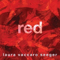
With Red, Laura Vaccaro Seeger completes a picture-book trilogy begun with Green in 2012 and continued with Blue in 2018. (We talk below about the possibilities of yellow, but Laura insists she is done.)

Talks with Roger is a sponsored supplement to our free monthly e-newsletter, Notes from the Horn Book. To receive Notes, sign up here.
Sponsored by

With Red, Laura Vaccaro Seeger completes a picture-book trilogy begun with Green in 2012 and continued with Blue in 2018. (We talk below about the possibilities of yellow, but Laura insists she is done.)
Roger Sutton: Terry [Borzumato-Greenberg; VP, marketing and publicity at Holiday House] sent me a copy of Red. I’ve been working from digital books for so long, it was a real pleasure to hold this in my hands.
 Laura Vaccaro Seeger: I know what you mean. Especially books like this — they don’t translate well into digital form.
RS: I know, it’s tough. When I looked at the PDF, I’d forgotten that there would probably be cutouts.
LVS: Which are really important, and then it gets completely lost in the digital format.
RS: You’ve always been a very hands-on book creator.
LVS: The tangible part of books is something I really enjoy.
RS: And still using acrylic paint.
LVS: Yes.
RS: You wrote about your love for it in the Horn Book some years ago. “Push the Paint."
LVS: That’s right! You have a wonderful memory.
RS: No, I looked it up. How do you marry your delight in tactile qualities and your love for color? How do we see that expressed in your work?
LVS: That’s such a good question. I’ve always had a love of color, going as far back as I can remember; combining color, mixing color. Even when I was in animation, I’d work with lighting so it would affect color. The sheer joy of moving over into books was that I could add that tactile quality and be able to combine colors.
RS: Whenever I look at one of your books, I want to put my finger on the page and move it around. Like I’m...pushing the paint.
LVS: I take that as a compliment because we are in such a digital age. I love the ability to be able to make something up, something tactile — especially watching children. A teacher in Singapore showed me a video of his ten-year-old daughter reading one of my books. She was going back and forth with the pages, feeling them to find where the holes were. The holes are often integrated into the paintings so you don’t really see them until you turn the page or are beginning to turn the page. I love to see kids “reading” with their hands that way. It’s kind of an added dimension to the experience.
RS: There’s a sort of scary one on that spread where the fox discovers the nail. Ouch!
LVS: That’s true.
RS: This is my second interview recently for a book about a fox. What is in the water?
LVS: Isn’t it amazing how that happens? Not necessarily the same book, in any way.
RS: No, not at all. Completely different.
LVS: You would know better than I, but doesn’t that happen a lot? In a certain season or a certain year — it’s almost like the authors got together and decided to do it. But that’s never the case.
RS: Sometimes you can trace it back to an event, like some big scientific discovery will a couple of years later, result in a bunch of books for children about that particular topic. But why foxes? Why now?
 LVS: I can answer that question for Red, if not for any others. While I was working on the story, one of the very first things I did was to identify anything red that I could think of. But I was particularly focused on animals, because I was looking for my protagonist; I was looking for my story. Right away, on my list of red animals, I circled “red fox” in my journal. But I immediately decided, no, I’m not going to use a fox, because it looks too much like a dog, and in Blue I used a dog. I completely ruled it out. I went on to write all these different versions of the narrative, using all different ideas — even at one point using red ants. It was pretty ridiculous. I was on the phone with Neal [Porter, VP and publisher, Neal Porter Books (an imprint of Holiday House)] one day, very, very frustrated — I wasn’t liking anything I was coming up with. It was a FaceTime call, so I showed him the page that I sent you. And he said, “Red fox.” I’m like, “No, no, a fox looks too much like a dog.” But he thought a fox was in the cat family! I said, “No, it’s in the dog family.” We got into this back-and-forth. And then I realized it doesn’t even matter which family it’s in. It doesn’t have to look at all like a golden retriever.
Sometimes when things stay in your head and you don’t work them out verbally with your editor, your friends, whomever, they might just get trapped there and wait. That conversation brought me back to realizing a red fox was perfect, especially because I pretty much knew what I wanted to happen. The protagonist would be up against all these obstacles — difficulty, pain, conflict, and rage — and everything I was trying to explore with the color. The fox was a good idea, but it took me a roundabout way to get there.
RS: When you settled upon a fox as your protagonist, did that change any of your thinking about the book up until that point?
LVS: What it did was solidify the narrative. It gave me something upon which to build, whereas, with everything else, I was trying to force it. With the fox, the story didn’t feel forced, and that’s something I try hard to avoid, having anything feel forced. The fox helped me move the narrative along. It would have been hard to even begin without really knowing what the story was.
RS: It’s interesting to me that you had an idea for a story before you even knew who it was going to be about. I guess I’m so used to thinking that characters come first.
LVS: Certain things were set in place because of the other two books. I knew it was going to be shades of the same color. I knew the trim size, and the fact that it was going to be a poem — a fifteen-line poem with four stanzas, two words in every line. All of that was set. This book was so inspired by the last one, Blue. I knew I wanted to explore feelings of conflict and exacerbation. I even have a wall in this book, and cages. You’re right, though — with my other books, usually the characters come to mind first. This was definitely the other way around.
RS: I think it’s to your credit that the three books, Red, Green, and Blue, are concept books, but I don’t really think of them that way, because they have such strong narratives.
LVS: Yeah, I don’t think of them as concept books either. Of the three, I suppose Green might be considered the most conceptual, perhaps, or the least narrative. I remember when the reviews started coming out for Green, and how much was made about doing the other colors. I remember thinking, No, no, it’s about the environment. The color’s just a tool. It’s about appreciating our environment. But then the other two really do have stories from the beginning through to the end. Because these books take so long to create — any picture book, but especially these because of the die-cuts — it’s really important, as the creator of the book, that I make something that I don’t get bored with halfway through. Having a story and characters that I’m invested in helps keep the interest going throughout that year or more that it takes to create the book.
RS: This is probably a really dumb question, but do you essentially paint the pages in order?
LVS: It depends on the book. With Red, Green, and Blue I had to because of the die-cuts. Every painting is a part of the one before it and the one after it. That means that I can’t skip around. I often have to go backwards. I’ll be painting the blood-red picture, for example, and I’ll realize, Oh, wait, that’s going to change what happens in rust red. I have to go back. Then I might do something that affects the page before that. I’m constantly taking one step forward and two steps back, going back into a painting that I thought I had finished. I’m used to this, so I never really think I’m finished until the book is printed. That wasn’t at all a dumb question! I’m trying to think if I ever go out of order. Probably with my earlier, more clearly conceptual books like The Hidden Alphabet — I definitely did that out of order. Each letter was self-contained. But for the most part I think I do go in order. Interesting — I wonder what other authors do.
 RS: If you were to do a fourth book in this series — let’s say a book about happiness — what color would you use?
LVS: First of all, I’m intentionally labeling this a trilogy because I don’t want to do another one. But I didn’t want to do a second one after Green or a third one after Blue, so never say never. What would be a happy color? Yellow? Yellow’s kind of like fear, isn’t it? But it could be happy too. Sunshine and rainbows. Yellow would be the logical next one, I suppose. But I don’t really want to — you’re going to have to mark my words, and then call me up and go, "See?"
RS: But if you do yellow, then Green becomes the odd book out, because the other three are the primary colors.
LVS: That’s right. Except in additive colors, where green and blue are the primaries — light and television and animation. The primaries are red, green, and blue. In subtractive colors, it’s red, blue, and yellow.
RS: Wait a minute. What did you say about additive color? I’m confused.
LVS: Additive and subtractive color. Subtractive color is part of things that you see. Whatever the light is, it’s subtracting out all the colors you’re not seeing. If you see something purple, it’s the result of the light subtracting out all the other colors in the spectrum so that you’re seeing the purple. Pink is a subtractive color. Physical forms in our world are all being seen by subtractive colors. Additive color is light. If you add different color light together and mix them, they make another color. With additive color, the primaries are different. The primaries are red, green, and blue. You know how you’re always seeing RGB with a computer? That’s because the computer is showing you light, it’s not showing you pigment.
RS: Because we’re using computers now for so much of the process, how hard is it to make sure that what I see on paper is what you want me to see when you’re creating the initial painting?
LVS: That’s another good question. I think because of my experience with animation, and also because I scan the paintings myself — I have two answers. The reason I’ve scanned all but four or five or six of my books is because these die-cuts are so difficult to figure out, that if I were to expect anyone else to try it, the holes would all be in the wrong place. So I have to scan in the artwork and then figure out where the die-cuts are. I do that part of the project on the computer. The computer has two different modes: one is RGB, where it’s showing you 16.7 million colors; CMYK is the colors you can see with your eyes. The eye can’t see 16.7 million colors. When the printer takes the book, they print it in CMYK, because it’s not going to be light anymore. It’s physical paper. The problem is, if you stay in RGB, making your artwork on the computer, whether it be from scratch or the way I do it, with paint and then scan it in, you could get yourself in trouble. I actually did get myself in trouble with my very first book, I Had a Rooster. I didn’t know all this then. I was coming from animation, and I didn’t understand print at all. There’s a mode you can use to switch to CMYK after the artwork’s already done, just to make sure the colors don’t shift. CMYK doesn’t have as many choices as RGB. Oftentimes it happens with blues. Blues will read purpley if you’re not careful. Now it’s not hard for me, but I can definitely see where it could get somebody into trouble. If an artist is handing in regular art, without scanning it themselves, then the publisher is basically doing what I’m describing. They probably know what they’re doing, and that’s not a problem either. I think the problem would come if the artist is scanning it themselves and doesn’t realize that there could be that shift. I don’t think I’ve had that problem again since my very first book, because I’m very hyper-aware that it’s a potential danger.
RS: You also have an exceptionally close relationship with your publisher and your editor, Neal Porter. That must help.
LVS: Oh, yeah. I feel so lucky. The way we work is so much fun. We have meetings that don’t feel like meetings — they feel like hanging out. We work at the beach; we work wherever. I don’t know what it would be like to work with another editor.
RS: How many books has it been?
LVS: I think Red is the twentieth or twenty-first.
RS: Wow.
LVS: I’ve never been with another editor. I stumbled upon the perfect editor for me from the very beginning, not even knowing anything about the business. Kind of dumb luck. If I had done what you’re supposed to do, send in a submission with a stamped self-addressed envelope and all that stuff, I may never have met Neal. I didn’t realize you’re not supposed to call up a top editor and ask for a meeting.
RS: Well, we’re all lucky it happened. You’re lucky, Neal’s lucky, readers are lucky.
LVS: Thank you.
RS: You're welcome.
Sponsored by


RECOMMENDED
Please register with us to continue reading.
ALREADY A SUBSCRIBER? LOG IN
We are currently offering this content for free. Sign up now to activate your personal profile, where you can save articles for future viewing.
ALREADY A SUBSCRIBER? LOG IN
Thank you for visiting.
We’ve noticed you are using a private browser. To continue, please log in or create an account.

Add Comment :-
Be the first reader to comment.
Comment Policy:
Comment should not be empty !!!