


2018 School Spending Survey Report

Make Meatballs Sing
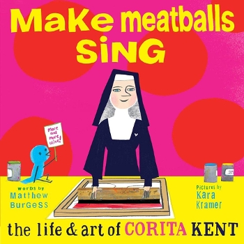
Make Meatballs Sing is surprising and wholly unexpected. It is the story of Sister Corita Kent’s eccentric life, and what makes the book unforgettable are Kara Kramer’s illustrations. They’re bold, avant garde, and unconventional.
 In 1937, C.S. Lewis reviewed J.R.R. Tolkien’s The Hobbit. Noting that his good friend’s story was unlike anything previously published, Lewis wrote, "You cannot anticipate it before you go there, as you cannot forget it once you have gone.” His sentiment perfectly expresses my thoughts on Make Meatballs Sing, which is surprising and wholly unexpected. An eighty-page picture-book biography about a nun? I never would have anticipated it. Just as I could never have anticipated the story of Sister Corita Kent’s eccentric life. But what is it? That thing that makes the book unforgettable? It’s Kara Kramer’s illustrations. They’re bold, avant garde, unconventional — and perfect.
Sister Corita Kent was a talented art instructor. From elementary to university art students, her teaching always included an element of play and experimentation. For one of her assignments, she asked her students to cut a small square window into a piece of cardboard; she called these "FINDERS." Leading them down Hollywood Boulevard, she instructed them to look through the windows "until the little details came alive." Like Hollywood Boulevard, the art in Make Meatballs Sing is vibrant, lively, and bursting with life. Let’s use our FINDERS and look at a few small details that lift this book from ordinary to unforgettable.
The first thing we see through our FINDERS is the book’s impressive and bold design. Slightly smaller than a 45 RPM record, this book has presence. At first glance, our eye is drawn to Corita. Her black-and-white habit effectively contrasts with the neon pink and yellow background, and her direct gaze and smile pulls immediately pulls us in. Next, our FINDER moves to the left and we see a sign-holding little blue bird. Interwoven throughout the book, his winsome presence symbolizes Corita’s light and playful spirit. The back jacket is a sixteen-square collage with mixed-media images including a photograph of Corita. Under the jacket in big block letters are her words, “Consider everything an experiment.” The front endpapers show our endearing bird observing his shadow, cutting out letters, and doing various other artistic exercises that Corita taught her students. In stark contrast, the back endpapers have photographs and quotes against bold blocks of color. The vastly different feel of the front and back endpapers is important, and we’ll understand why when we move our FINDERS.
One of the most striking elements of the art is the use of oversized typefaces and handwritten words. Interwoven throughout the book, they effectively emphasize and reflect how Corita used letters and words to instruct students. Other design details we notice are the textured jacket, color blocked pages, a gatefold spread, and comprehensive back matter. From cover to cover, this is a strikingly beautiful book. But it’s time to shift our FINDERS from design to illustration.
Through this FINDER view, we notice details showing us how masterfully Kramer’s illustrations capture and reflect Corita’s art and life. The first few pages are about her childhood, growing up in Hollywood, California. There are small elements of collage sprinkled throughout, but overall, these pages feel secure and traditional. They begin to feel innovative when Corita Kent’s father encourages her to do something original. It’s the first time oversized words and color blocking are used, and from here Kramer’s illustrations get increasingly more playful, daring, and (wonderfully) unpredictable. Why is this detail important? Because the progressively evolving illustrations reflect Corita’s life. Beginning with the moment she announced her decision to take her vows to her innovative teaching methods until final days spent exploring the outdoors, she acted on her strongly held beliefs. Courageously defying conventions became her norm. From creating artwork which often interwove scripture into elements from mid-century advertising to encouraging Immaculate Heart to make the traditionally somber Mary Day into a joyful celebration, Corita acted with deep conviction and unreserved passion. And this spirit is reflected through bold and boundary-breaking illustrations. Elements of collage, vibrant swaths of color and texture, and a range of mediums are used on almost every spread. They’re jubilant and loud, but never overpowering. In an effective juxtaposition, when Corita asks to be released from her vows, the spreads are simple and reverent, reflecting the weight of her decision. The book incorporates a variety of different vignette features — including steps for the silkscreen process, a numbered series of Corita’s travels, and a word web — and every single illustration is immersive and altogether captivating.
Sister Corita Kent’s art and life “invited others to see the sacred in the everyday.” Though they may not use cardboard FINDERS, the Caldecott committee is charged to look past the ordinary and focus on details that set books apart. Details that make a book sacred. Details that make a book sing. Corita made meatballs sing, and Kramer’s art paired with spectacular book design make her story sing. Unanticipated and unforgettable, indeed!

Added To Cart
RELATED


RECOMMENDED
Please register with us to continue reading.
ALREADY A SUBSCRIBER? LOG IN
We are currently offering this content for free. Sign up now to activate your personal profile, where you can save articles for future viewing.
ALREADY A SUBSCRIBER? LOG IN
Thank you for visiting.
We’ve noticed you are using a private browser. To continue, please log in or create an account.

Add Comment :-
Be the first reader to comment.
Comment Policy:
Comment should not be empty !!!