


2018 School Spending Survey Report

Some (former) Real Committee Members Talk Books!
One of the aims of Calling Caldecott is to model book discussion about picture books — the kind of granular discussion that would occur on an actual Caldecott committee. Today we listen in on just such a conversation between several members of the 2020 Caldecott Committee as they discuss three eligible 2022 titles.
A quick note before we jump in: as I'm always saying, one of the aims of Calling Caldecott is to model book discussion about picture books — the kind of specific, granular, almost microscopic discussion that would occur on an actual Caldecott committee. So I'm very excited about today's post: a conversation among several members of the 2020 Caldecott Committee as they discuss three eligible 2022 titles of their choosing. Chair Julie Roach and committee members Joel Bangilan, Ericka Brunson-Rochette, Christina Dorr, and Linda Klein reunited over Zoom to share with one another what they appreciated about Knight Owl by Christopher Denise; I Love You Because I Love You by Jessica Love; and Ain't Burned All the Bright, illustrated by Jason Griffin and written by Jason Reynolds. Let's listen in. — M.V.P.
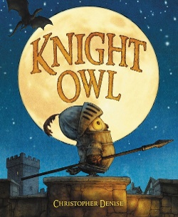 ERICKA: Knight Owl uses light and shadow to capture depth and perspective in a whimsical and believable way — considering it’s a story about an owl’s journey into knighthood — from the subtle details on the endpapers [holds up book to show the endpapers] to the perfectly captured expressions in the eyes of our brave title character. I'd love to start with the cover of this book. I have taken off the dust jacket [shows cover]: we've got little Owl here, looking both brave and, like, “What have I got myself into?” I love the little details sprinkled throughout the book. Even on the title page, you know you're about to go on a journey — little Owl is reading a book about knights, and there are subtle hints throughout his room. They make you wonder at the end of the book: was this something that really happened, or was it a dream? All those subtle visual clues on the title page allude to what we are about to hear and see.
CHRISTINA: I want to bring up the use of perspective, and I want to show a series of pages that illustrate this. When the dragon first appears at the castle, our little owl’s back is turned. The next few pages, that perspective changes, and the owl now sees the dragon. Then we start to see the threat through Owl’s eyes and he's challenging the dragon with the sword, right up to the point at which we're looking at the owl almost through the dragon's eyes with that sword pointed at his nose. And then you see the change of perspective again. Each page-turn has brought a change of perspective.
ERICKA: I also really loved the progression about two or three pages before that. There's a shadow, we're now in the perspective of the reader and can see that there is a dragon coming, and once you turn that page, you know something that Owl doesn't know, and then the story flips and then we start seeing things through Owl's eyes. I love that build-up.
JULIE: Other appreciations?
JOEL: The use of light and shadow is pretty masterful. If you take a look at this one [shows first page], you see how light is entering the kitchen, and it's through that portal that we see not only the whole scene but that's where light is. We can see how the light shapes in on the mother's face and on her clothing, That's a complicated technique. Even in the title page, where light is coming through, you see it illuminated in the air, not just on a surface. [Shows “To be a knight” spread] The light and shadows going through trees, that's a really remarkable technique to show the light penetrating through trees and leaves and branches.
JULIE: And thematically interesting, because an owl sees so well in the dark.
LINDA: I really love the use of foreshadowing, like in the very first scene dad's reading about knights in “The Olden Times.” There are these great touches of humor, so many subtle little details like this scene where Owl's dreaming a medieval tapestry. It tells the whole story and he’s in it.
JULIE: And they are having pizza at the end of that tapestry.
LINDA: And you see him on the battlement, how brave! And then you turn the page, and he's standing on a stepladder. The artist makes you focus. You only see Owl's face through the visor, but his eyes tell everything. Here's the dragon, and you see all the emotion and personality there, but you never see the knights’ faces. No matter what they're doing, they've got their visors closed. As you go spread by spread, the dragon’s head gets bigger and bigger and more threatening — until he gets the pizza and his head shrinks back down.
CHRISTINA: One thing to add to what Joel said is the use of light to spotlight in the book, particularly this page where the rays of sun are coming in spotlighting the owl. I thought that was very well done.
JULIE: It's a lot of strong contrast. There's light and dark. There's size — large and small. And there are the shifts in perspective.
Should we move on to the next book?
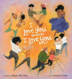 LINDA: All right. I Love You Because I Love You. If I were to use one word to describe this book, I would use exuberance. We've got an introduction to all the characters in the book on the front and back cover, and we're going to find out about these people. It's very intimate. If you look at how every spread is laid out, you realize it's the same people from one side to the next. One of the things that struck me was that the illustrator focused in on the faces and the body language, so your attention is drawn there. In this scene with the parents and the little child drawing on the wall, I love the expressions and the body language of the two dads. One of them is about to lose his cool, and the expression and body language of the other dad, his hand on his shoulder, you could just see the fingers start to dig in and then it translates into this joyous scene. The interesting thing to me is that we get that mirror — action, reaction, action, reaction. There are also some wonderful surprises in this scene with the stadium. Who is waiting for whom here? Then at the very end, you have this great double-page spread where all the characters have come together, and it's almost a circle dance that's happening. And the use of color — the orange in the middle is echoed throughout the different parts of the book. Sometimes the color will draw your eye right to the center of the picture and to the people, to the faces. I think it's a well-laid-out concept with the use of space, the placement of characters, the different details. At the very end we hark back to the very first family we saw — the mother and baby. I love that the pictures represent so many different ways to love. Love is not just one thing. It shows all these different ways that people can love each other, and with all their different relationships.
CHRISTINA: I have one other appreciation to go along with what you just said; it is the realistic situations depicted. But also there are inconsistencies in the proportions of the bodies of the children. Some were beautifully proportioned and others looked like small adults. I would like to see them as more realistic.
ERICKA: I think Linda really captured a lot of the beauty of this book very well. I feel like Jessica Love captured what love is through how we show love on our face, how our bodies show and receive love, and our interactions with each other — [shows page] we have a toddler drawing on the wall. But then her fathers in the spread appreciate the joy on the wall. I also like that there were sprinkles of hearts throughout this that were really subtle. Some of the patterns on clothes were hearts. On the cover it looks like they are in the shape of a heart, and these two individuals are making a heart. This brought together the theme of love for me.
JULIE: I like how the art takes this call-and-response text and gives it a lot of variety. You have different perspectives and far out and close in. Certain spreads invite you to turn the page. We've got this character here pointing at the shooting star which is leading us to the page-turn. Here with these two kids in the grass looking up at the sky, it makes you pause. Some of the pages slow you down, and some of them push you on into the next vignette. The figures are realistic but sort of stylized and not perfectly proportional, but they're flowing and those expressions reach right into you.
LINDA: My only concern has to do with the gutter on the last page, the way the book is bound. [Shows last double-page spread.] I could see that everything was there, but I had to work at it. If you lose something in the gutter, you're losing part of the story.
JULIE: Moving on to our final title, Ain't Burned All the Bright?
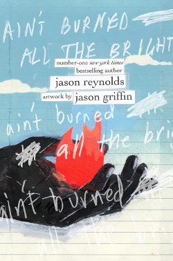 CHRISTINA: Jason Reynolds said he wrote three very long sentences and sent them to his longtime friend and illustrator, Jason Griffin, who physically cut up those three sentences to illustrate the book. It is done in breath one, breath two, and breath three. If you feel the cover, it’s raised as if a little piece of paper has been cut and taped on, and the spine is done the same way. I'm going to point out a few pages, because there is so much being said in this book through the illustrations. Black is an overriding color in this book, it frames every page, if it doesn't consume the page. On this page he says, “and my sister talks to her homegirl through the screen of her phone like it's the screen of a front door.” We don't see her holding a phone. We see her holding a home, a house. It's very symbolic. Here [shows page “and it’s more like he’s swallowed the sun and it’s burning bright”], in referencing catching a breath, Jason Griffin gives us a maze rather than an in-and-out breath. He's saying that it is complicated to be able to catch our breath during this time. It’s referencing more than one thing. There is still fire and life left, but also this denotes Covid, because his father is sick — fire in his chest and his throat. On this spread [shows “and maybe oxygen masks are stocked in the books on the shelf my mother’s been begging us to read”], all the color with the black background suggests possibilities, but then the next page goes very stark because they are books not read yet. So much of the book is a metaphor for learning to read between the lines of a story. The last piece I want to point out is the very last segment of the book. We have the destruction of a tree and then we have the drawn possibility of a new plant; we see a character breathing in the scene of a flower and then blowing out a candle on a cupcake. Breathing in, breathing out. Life goes on, but altered.
JULIE: Anyone want to jump in?
LINDA: I thought the use of symbolism was incredible, because he sometimes switches the meaning. Sometimes he will have a cloud representing hope and life and breathing. But then you might have a cloud of tear gas completely covering someone's head. It can represent breathing, but it can also represent suffocation. In the three parts, the color red represents three different things. In the first part, the flames and fire reflect the news of the day. Then in the second part it's personal. The fire is now in his father's body, burning bright, but not necessarily burning bright with wonderful things, he's burning bright with disease. And in the third part, red starts to represent some hope, like the sun rising. The symbolism changes as the story progresses. I thought that was really masterful to take colors and make them represent different things. When the brother is playing video games, it seems like a quilt, and when the father is holding the family in his arms, they're all houses. The use of color is a story in itself, and then through the imagery he uses with that very limited palette, he's able to create so much meaning.
ERICKA: To build off the symbolism that Linda brought up, I noticed the repetition of houses, and the meaning behind them. What is a home? What is a family, and what defines what a house is? And there are a lot of chairs. I found those things separately to be fascinating, but together, they add up to the idea of the experience of the pandemic. Suffocating. Waiting. One of the images that Christina mentioned was the book that has yet to be read. I like the use of the chair in that one. We are waiting. There's still time to read this book. And the spread where it looks like the chairs are flying around like we don't know what we are waiting for. The emptiness of waiting. One of the last illustrations we see is the chair, but now it's got life. It's growing, and it's breathing something new.
JULIE: It's technically so articulate. Each page in and of itself is a perfect composition and leads beautifully into the next one. It’s so well-paced — sometimes it moves you quickly, and sometimes it slows you down. This idea of a picture book as an art journal. All the tools he used to make this book are the tools that you would use to make an art journal.
LINDA: I wanted to make one comment about the black borders. That reminded me — I don't know if people use this anymore — that bereavement stationery oftentimes would have a black border, and that jumped out at me.
CHRISTINA: Much of what is in here is concrete, very concrete, but yet, so much of it is abstract. The book takes you from the concrete — the year that we lived in our homes — into the abstract and into the injustice.
JULIE: I can't know what was in Jason Griffin's mind with the symbolism, but I know what it means to me and I know how it feels to me, and it's powerful to connect to an audience in that way through art.
ERICKA: This was like walking through an art museum of somebody's experience, through their eyes. I loved how open it was to interpretation — this is one story, but collectively it is the story of many.
LINDA: We look at books appropriate for up through age fourteen, and I think it's worth pointing out that the Caldecott criteria allows for a book like this to be considered. It's not a traditional picture book, but it's a story told through illustration.
JULIE: It's not thirty-two pages, but I would certainly argue that it functions as a picture book and could resonate for quite a span of kids in our age range.
We’re running out of time so we’ll leave it there. You know, I really miss talking about the art in picture books with you all. We should do this every year!
Martha here again: I'm very grateful to Julie for organizing the event, leading the discussion, and wrestling with the Zoom transcript — and to her and to Joel, Ericka, Christina, and Linda, members of the 2020 Caldecott Committee, for their time and insights. Speaking of insights, what would you add to this conversation? Leave your comments in the comments!

Added To Cart
RELATED


RECOMMENDED
Please register with us to continue reading.
ALREADY A SUBSCRIBER? LOG IN
We are currently offering this content for free. Sign up now to activate your personal profile, where you can save articles for future viewing.
ALREADY A SUBSCRIBER? LOG IN
Thank you for visiting.
We’ve noticed you are using a private browser. To continue, please log in or create an account.

Add Comment :-
Be the first reader to comment.
Comment Policy:
Comment should not be empty !!!