


2018 School Spending Survey Report

Blue
Texture and depth pulled me into Laura Vaccaro Seeger's Blue, and texture and depth are what carried me through (and then back to the beginning, and then through again).
 Texture and depth pulled me into Laura Vaccaro Seeger's Blue, and texture and depth are what carried me through (and then back to the beginning, and then through again). Picking it up for the first time, my immediate instinct was to manipulate the book — to feel its weight, to run my fingers over the jacket — and this impulse was rewarded. The title is raised, providing lovely tactile feedback and inviting readers to consider the many layers and facets of a title that, on the surface, seems straightforward enough. And indeed, Blue is multidimensional. It is the companion book to Green, Seeger's 2013 book for which she earned a Caldecott Honor, and although the two share many similarities, Green speaks to the natural world; Blue speaks to the heart.
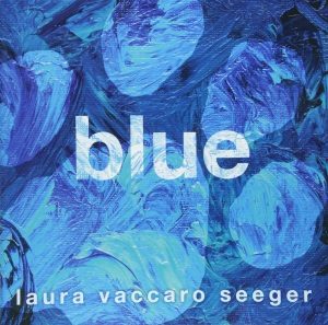
Blue is often a conversation in contrasts, and this is evident as soon as the book is opened to reveal the endpapers and title page. The cover art is dark and dramatic with swirls of cerulean suggesting a dog's paw print. The title page is an exhale — variations of sky blue textured behind a bold title. It is a place to pause before we keep looking for answers. The two experiences — the cover art and the title page — announce, ostensibly, the same information, but they feel so, so different, and this is the magic of Blue. From the very beginning, we are invited to examine the ways in which color and its varying degrees (and the relationships between those degrees) can serve as evocation. Seeger's text is spare and simple, but, paired with her redolent acrylic on canvas, it is plenty to make us feel something that's been stirred up from deep within.
As in Green, Blue ingeniously employs die cuts and allows them to function as a tool to move the visual narrative forward (then backward, then forward again). On the verso, a blue dog bone, after a page-turn, becomes a blueberry; leaves from the blueberry bush serve to illustrate an unfortunate series of paw prints; smeared paint gets lost in the sapphire mosaic of a butterfly's wing. I found myself flipping back and forth between pages, engaging with Seeger's impeccable ability to make artistic elements that are integral to one page's narrative become at once completely lost and completely necessary for the book's next step. Similarly, die cuts on the recto help readers anticipate what might be coming. A slight hint at a page-turn, a tiny lift of a smooth, thick page, enlivens the die cut and pulls us forward: where is this smear of color, the one lending itself to this ocean-side beach ball, coming from? What will it be? And will it still be the thing before? The magic and drama of the page-turn are not lost here. Not even a little.
Although this is a book about a boy and his dog, each double-page spread is a vignette that, for all intents and purposes, can stand on its own. I found myself lingering on the “stormy blue” spread, full of tones so deep I had to adjust my light. Splatters of paint suggest droplets on a window pane, separating me from the page and defining my role as onlooker, intruder. What was I witnessing? What brought this boy and this dog out into the woods on such a stormy night? Were they lost? Are they reuniting? Where are they going next? There is so much to pull from each of these vignettes. Again, what drew me in is what carried me through. Blue's beautiful texture and depth cannot be overstated. Seeger's deliberate brush strokes, velvety and supple, paired with her use of tonal variation, often implored me to touch the pages, searching for tactile feedback similar to what I received from the book's jacket, feedback that might match my emotional response.
And all this without any mention of the book's narrative arc, which, if you're anything like me, will leave you weeping, despite heavy-handed foreshadowing. The seasons of life — both literal and otherwise — are strong players here, and although the title does deliver (we are certainly taken there, to that blue, blue place), Seeger's lush artwork and clever use of design elements invite us to explore what this color can mean to all of us at different times and in different stages of our lives.
[Read the Horn Book Magazine review of Blue here.]


Added To Cart
RELATED


RECOMMENDED
Please register with us to continue reading.
ALREADY A SUBSCRIBER? LOG IN
We are currently offering this content for free. Sign up now to activate your personal profile, where you can save articles for future viewing.
ALREADY A SUBSCRIBER? LOG IN
Thank you for visiting.
We’ve noticed you are using a private browser. To continue, please log in or create an account.

Add Comment :-
Comment Policy:
Comment should not be empty !!!
Alys
Coincidentally this was the book I was using in my Mock Caldecott this week, so I've read it 14 times today! It was a book I wasn't originally excited to read, thinking, like Susan, that it'd be too close to Green. But I shouldn't have doubted! I found it very different and "individually distinct" both from its companion color book and other books published this year. Did anyone else miss the paw print on the front cover? It took one of the second grade students I read the book with to point it out to me. I was very impressed with the die cuts. On the one hand, it does feel a little gimmicky (unlike last year's Grand Canyon they don't serve a true function), but on the other hand several classrooms had a lot to say about how they felt the "holes" helped to make a connection from one vignette to another, making it clearer that they are all connected. And the execution is amazing. Not just planning for the colors to match, and to match across several page spreads, but also the shapes as well, plus adding in that the book rhymed and she had to choose which picture to do with which rhyme....the meticulous attention to detail is impressive. The students I read the book with especially enjoyed the through-line of the blue cloth that serves as baby blanket, handkerchief, dog collar, and memento.Posted : Nov 08, 2018 06:34
Sam Juliano
"Blue is often a conversation in contrasts, and this is evident as soon as the book is opened to reveal the end papers and title page. The cover art is dark and dramatic with swirls of cerulean suggesting a dog’s paw print. The title page is an exhale — variations of sky blue textured behind a bold title. It is a place to pause before we keep looking for answers. The two experiences — the cover art and the title page — announce, ostensibly, the same information, but they feel so, so different, and this is the magic of Blue." Superlative observations here, as are many others in this wonderfully passionate and comprehensive assessment. I consider BLUE one of the great picture book achievements of the year. I'd like to note that Polish film director Krzysztof Kieslowski’s Three Colors: Blue is the second part of a critically-praised 1993 trilogy made in France which features acclaimed actress Juliette Bincoche as a woman self-driven into isolation after her husband and child are killed in a car accident. Like the other films in the melancholic triptych, Blue makes frequent visual allusions to its title: numerous scenes are shot with blue filters and/or blue lighting, and many objects are blue. When Julie thinks about the musical score that she has tried to destroy, blue light overwhelms the screen. Blue has been often been given poll-position designation as the world’s most popular color, a perceived fact largely because it is the color of the sky and the oceans. Prime associations with this formally sedate and less conspicuous pigment are intimacy, deep thinking and privacy, though it is vigorously opined that the color is symbolic of loyalty and nostalgia. Children’s book artists in recent years have lavished much of their pictorial attention to the color, and the result has yielded some sumptuous works. Isabelle Simler’s French import THE BLUE HOUR, features thirty-two blue colored ovals, each exhibiting a different shade of blue are labeled with the corresponding color. Even the instructor will be hard pressed to immediately recognize some of the eclectic variations, such as “porcelain,” “cerulean,” “Maya” and “periwinkle.” Peter Sis’ Robinson, a dreamy take on the Daniel Dafoe classic is an interpretation of the color as a portal to adventure, while Mordecai Gerstein’s dominant employment of an aquamarine variation still made for a veritable feast for the eyes of blue denizens. In 2018, Laura Vaccaro Seeger, who six ago gave the color green a vital new interpretation in her Caldecott Honor winning GREEN (which you also mention here is proper context), in suffusing the work with renewal and re-birth, has applied the same formula on her new book, crafting seventeen double page canvasses that is unison provide young readers with the picture book equivalent of the images filmed by cinematographer Slawomir Idziak in the Kieslowski film. Each ravishing tapestry resonates with thematic richness, bringing astonishing emotional heft to a simple story of a boy’s love for his dog during the formative years. Seeger insists that the color is a vital force of nature in the life cycle, that it defines human interaction with a canine companion, can be hot or cold, is present at birth and at the end of life and exerts soulful energy during those priceless moments meant to ensconced in the sphere of memories. A champion of acrylic paint on canvas board base, Seeger’s thick applications of converging shades of the color produced a stunning cover, again like on the cover of Green bleeding onto the white lettering denoting the title with almost storm-like intensity. It’s gorgeous. No picture book released in 2018 quite matches the emotional clout Seeger has quietly mounted in BLUE, though arguably two other masterpieces equal it in that regard (ADRIAN SIMCOX DOES NOT HAVE A HORSE and A HOUSE THAT ONCE WAS). By transferring the central focus to a relationship as opposed to the regeneration of plant life on the planet she tapped into with Green she has broached all to real matter of life and death, new relationships and appreciation for what we have and the indelible experiences that define who we are. With remarkable minimalism and the highest level of illustrative sublimity one can bring to a picture book Seeger has probed the deepest of emotions while treating readers to a trenchant study of a beloved color. As magnificent a book as Green is, Blue, which matches it artistically makes that ever so profound human connection. A masterpiece and surely one of the very best works of the year on multiple levels. Yes, the book DOES absolutely leave you weeping. I've watered numerous tissues beholding it repeatedly.Posted : Nov 08, 2018 05:36
Susan Dailey
Rebekah, your review made me go back and study "Blue" again. In my personal notes about the book, I'd appreciated the texture and die-cuts, as well as the saturated colors. However, I'd dismissed it as a serious contender because I felt it was too much like "Green." Thanks for pointing out all the details I'd overlooked and the feelings the story evoked. (I don't remember "Green" having a story. Did it?) The committee will surely examine this title and have a lot to discuss.Posted : Nov 08, 2018 03:25