2018 School Spending Survey Report
Covers make the book, and both of these titles, related by theme, have stunning covers.

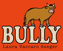
Covers make the book, and both of these titles, related by theme, have stunning covers. Once you see them, you are unlikely to forget them. That lone bluebird flying over the city portends the poignant story within, and that bull, bathed in bold red, defiantly glaring, dares the reader to even open the book.
The reason I want to talk about these two books together is that they touch on the same theme: bullying. There are times when a committee might gather all the books on a topic and talk about them together. This year, we have at least three train books that are exceptional, and, so far, two books that touch on the tricky subject of meanness/bullying/social cruelty. What if the chair decides they could be talked about together? I am not saying the chair will, but sometimes it is an interesting way to jump-start a discussion.
How might that go? First, the books would stand together on the table and people would compare them.
Similarities: Both author-illustrators tell their stories with very few words. Both employ limited color palettes: Staake uses grays and sky blue, Seeger favors lots of brown on brown textured paper. Both present the idea of mean kids as the complex idea it is, rarely one-sided. In Bully, the little brown bull starts out with the angry words "GO AWAY!" being hurled at him. In Bluebird, the mean kids show remorse (and then run away). The committee would probably talk about characters and how they might connect with the intended audience. And here is where the conversation would turn to the individual books.
Staake's incomparable computer-created graphic design is complicated and emotional. Scattered throughout the cityscape are street signs and business names that are the only words ("The Steadfast Independent: Books," "Gotham Café") in this story of friendship and loss. The protagonist, a little boy in a striped shirt, is befriended by a bluebird whose bluish purple color is brilliant against the light blue sky and the gray world that is school. Panels of varying sizes, spread across the gutter at times, give clues as to how time is passing in this friendship. The little bird helps this loner meet kids at the park, and the illustrations lighten. It's the light in this book that really sets the tone, especially when the boy starts home and is met by three kids who try to take his toy sailboat and end up killing the bluebird, who deflects the thrown stick. There is a moment of reflection and sorrow when a redbird enters the scene. Suddenly, birds of all colors fly the little boy into the air, where he sends his friend into the clouds. The final endpapers show the little boy smiling at the clouds. To get back to Martha's question here, the committee will talk about the story. Since this is wordless, the committee will have to decide if the story is clear to the reader or open to interpretation? The champions of this book will have to answer the inevitable questions about sadness and loss that Thom Barthelmess talked about here. Though there is nothing in the world to stop a "sad" book from winning the Caldecott, the committee will discuss how the pictures tell the story.

Seeger's india ink outlines (drawn with an ink-dipped STICK, for goodness' sake) on handmade paper are bold, with most pages containing a lot of open brown-speckled space. Amongst the committee there would be discussion of the handmade paper and whether that adds to the story. Why was it chosen? The fence in each spread is important as it helps the reader realize that the little bull is staying in the same place but his size is fluctuating. By the time the goat calls him out, the bull is no longer a little bull at all--indeed the open space is just a sliver, and his eyes are creased with worry and remorse. And by the end, he is the right size again and the fence has its first opening, just wide enough for the new friends to walk through. Together. I think the committee will dive deeply into the simplicity of the story, and the book's champions will have a lot of fun pointing out how the design of each page is carefully constructed to show the emotional state of the little bull and how Seeger uses the boundaries of the book, even allowing her main character to nearly explode out of them.
In the end, I think they, as I do, will see some thematic similarities, but will struggle with direct comparison (just as I did). The more I think about it, the more I realize how difficult it is to compare any book to another.
Both of these books have been around for awhile. Have you seen them? Shared them with children? What do you think of them as visual experiences?
RELATED
RECOMMENDED
ALREADY A SUBSCRIBER? LOG IN
We are currently offering this content for free. Sign up now to activate your personal profile, where you can save articles for future viewing.


Add Comment :-
Comment Policy:
Comment should not be empty !!!
elisa kleven
STUART LITTLE had an open ending that made me terribly melancholy as a child but that I now love. I wonder if children like crave open-ended endings more than adults do. Just pondering/butting in here. (Btw, I think Amazon comments are interesting, especially if taken in in small doses: a very democratic hodgepodge of usually heartfelt reactions to books.)Posted : Oct 11, 2013 02:42
Julie Danielson
This is straying from what you all are discussing, but here goes anyway ... Re Bluebird: I sometimes sense this disdain for picture books with open endings, and I wonder if that will hurt Bluebird's chances. I, personally, think this picture book does the kinds of things a committee likes to see (Martha mentioned, for instance, how the palette reveals emotions, and there's much, much more), and I really like it. But it has an ending so open to interpretation that, sadly, I think it turns many readers off. I got this sense from Jacqueline Woodson's Each Kindness, illustrated by E.B. Lewis, last year. I was surprised by the number of people I talked to who were frustrated by the very open ending. I still remember this conversation Roger had last year---https://www.hbook.com/2012/02/blogs/read-roger/whaddya-say-to-taking-chances/---and how Sergio Ruzzier wrote in the comments, "Please, let us have a little bit of uncertainty, here and there, otherwise life can get pretty boring" (his point being that European picture books tend to leave more room for uncertainty, for leaving some things unexplained). So many parents I meet want answers and tidy endings in the picture books they read to their children. Staake's book leaves space for the reader, and I like that. I'm not suggesting committee members will turn their nose up to anything without a tidy ending, but I am surprised by the number people I meet who get almost angry at the absence of a neatly wrapped-up story. (Maybe I just need to get out more!)Posted : Oct 11, 2013 01:46
elisa kleven
I think that books which lift heavily from other, earlier works, should be evaluated a bit more critically than original work. It's a question of ethics, if that doesn't sound too old fashioned. Creating an original work of art is an amazing, arduous feat. I am in awe of those people, whether musicians, painters, writers, or picture book creators, who have done it. They give a great gift of themselves to humanity. Revising another person's work also takes skill and craft. And the capacity to be truly inspired by others is admirable And of course, all artists borrow and use a collective bin of collage supplies. But I do feel less inclined to wholly embrace and truly admire a work when it's (and this can be hard to determine) derivative. All that said, now I need to read BLUEBIRD.Posted : Oct 10, 2013 07:45
Martha V. Parravano
About BULLY: The thing I appreciate most about BULLY is, as Robin noted, its visual representation of the main character's emotional state. It's so simple but so effective, and the series of page turns in which we see the bull(y) deflate like a balloon someone has just let the air out of is just sublime. I think the telling here transcends the message--although I wonder if the solution is a tad simplistic? Maybe not, though, for the intended audience. About BLUEBIRD: Again, as Robin said, it's all about how the palette reveals the emotions and how the panels progress the story -- to me this is a true picture book/graphic novel hybrid. I do wonder about the inclusion of that billboard advertising the book BLUEBIRD ... which I get is a playful little meta thing, but I wonder what Caldecott committees make of it.Posted : Oct 10, 2013 03:09
Robin Smith
I have been thinking about this all night--I am not sure how a committee would discuss this. Comparing a book to another work is not part of the process, at least according to the criteria. The discussion would probably stick very closely to the illustrations and story: did the illustrator achieve his or her goal? Is the art excellent? How does the illustrator tell his story? Why did he choose this particular style? Things like that. Now, that is not to say that other issues do not come up either spoken or unspoken, but the discussion stays very very close to the terms and criteria.Posted : Oct 10, 2013 01:22