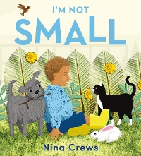
I'm here (once again!) to put in a plug for picture books aimed at the very youngest -- books that rarely receive Caldecott recognition. Today it's the turn of Nina Crews's I'm Not Small and Antoinette Portis's A Seed Grows.
Yes, it's time once again to bring our readers' attention to books that rarely receive Caldecott recognition: books for the very youngest. There are exceptions, of course. Recent ones like 2020 honor book Bear Came Along, and classic ones like 2005 Caldecott winner Kitten's First Full Moon (for such young readers that there's now a board book edition). But generally speaking, the Caldecott skews older. As Elisa Gall said in the Calling Caldecott blog post All A-Board: Why the Hell Hasn't a Board Book Won the Caldecott!?: "I think the bias against books for children at both ends of the 0–14 age range is always an issue, and that bias against books for babies and toddlers is real."
In past CC posts I've argued for Byron Barton's My Bike; Bedtime for Sweet Creatures by Nikki Grimes and illustrated by Elizabeth Zunon; My Best Friend by Julie Fogliano and illustrated by Jillian Tamaki; Barbara McClintok's Vroom!; and others. Today it's the turn of the 2022 picture books Nina Crews's I'm Not Small and Antoinette Portis's A Seed Grows.
 Conceptually, I'm Not Small is perfectly pitched to its audience. The preschooler narrator explores his [per the flap copy] world, remarking that he's smaller than the trees and the sky but bigger than his dog, cat, and rabbit and also birds, a bee, and an ant. On spacious double-page spreads Crews consistently provides young viewers with the opportunity to compare sizes of things: the boy's boot versus a tiny little ant; a tall tree in comparison to the smaller child, who is still bigger than the rabbit, dog, cat, bird, and flowers shown on the spread.
Crews uses a variety of perspectives throughout to keep us always in the narrator's experience. When the boy feels small compared to the sky, trees, and his backyard, WE feel small, too. When he rejoices in the realization that he is also, in fact, big, WE rejoice, too.
The medium is a perfect fit for the story. The art was created digitally but incorporates photographs (it IS Nina Crews after all!) and textures created by the artist. This collage effect allows Crews to focus our eye exactly where she wants it, whether on the majestic trees or the boy's speckled blue hoodie or bright yellow boots or beautiful brown face. And the grass is so lushly textured that viewers will find themselves reaching out to touch it.
This post is one concentrating on the book's art, not the book's text, but that holds plenty of interest, too; young readers will relate to the boy's excitement about venturing outside for the first time and to his curiosity about the natural world and his place in it. (They will also, hopefully, relate to his decision not to squish the ant but instead observe and appreciate it.)
 Antoinette Portis's A Seed Grows similarly elicits an appreciation for nature — in this case, the life cycle of a sunflower. This book isn't just for the very youngest readers; it's for the very youngest scientists. The clarity of her sequential explanation of the sunflower's life cycle (from seed to flower and back to seed again) is superb — but let's talk about the art and the page design that supports it.
It's one of the simplest yet one of the most arresting layouts I've ever seen. As on the right-hand page a black-and-white sunflower seed falls through the blue of what we presume is the sky, on the left side are just three words: "A seed falls." But the word seed is streaked black and white just like the sunflower seed on the right, tying the word and the image inextricably together. Turn the page and now we see the seed nestling into brown soil — and yes, the text on the left page contains the word soil in a matching mottled brown. As the process continues, the pictures on the right add more elements, but always we know what to look at because of the color-coded word on the left page.
After a stunning gatefold illustration of the full-grown sunflower, the pattern changes: Portis switches to a series of double-page spreads, allowing her to quickly and efficiently depict how our flower's seeds are dispersed (birds are involved) — and the cycle begins all over again ("And a seed falls").
I've focused on the book's design, because it's so elegant and on-target for the audience, but surely you can tell by now how much of a role COLOR plays here. The colors don't just tie everything together, they are gorgeous in themselves — saturated, textured, harmonious. The effect of these colors contrasted with the white space on the left-hand pages is eye-popping and hand-tempting. Like the Crews, it's a book to reach out and touch.
(To read more about these two brilliant books — and to view some interior images — see Jules Danielson's Seven Impossible Things Before Breakfast blog entries: here and here.)
I'll simply end with the exhortation to "Remember the youngest!" If you agree, what other qualities do you see in these two books that might recommend them to the Real Committee? And are there other 2022 books for preschoolers that you'd champion here?
RELATED
ALREADY A SUBSCRIBER? LOG IN
We are currently offering this content for free. Sign up now to activate your personal profile, where you can save articles for future viewing.


Add Comment :-
Be the first reader to comment.
Comment Policy:
Comment should not be empty !!!