


2018 School Spending Survey Report
CaldeComics 2020
Another year, another opportunity for graphic novels to make their way into Caldecott discussions. If, as Travis Jonker writes, wordless books are “Caldecott catnip,” then what does that make graphic novels? “Graphic elements” in picture books certainly seem to be an enticing treat (see: Mr. Wuffles!, A Different Pond, Creepy Carrots!, et al.). Longform graphic novels, on the other hand, are more like Caldecott cat-nopes. Will that change this year? I don’t know. But here are two graphic novels that certainly have my vote.
Another year, another opportunity for graphic novels to make their way into Caldecott discussions. If, as Travis Jonker writes, wordless books are “Caldecott catnip,” then what does that make graphic novels? “Graphic elements” in picture books certainly seem to be an enticing treat (see: Mr. Wuffles!, A Different Pond, Creepy Carrots!, et al.). Longform graphic novels, on the other hand, are more like Caldecott cat-nopes. Will that change this year? I don’t know. But here are two graphic novels that certainly have my vote. Fair warning: both books just might make you cry.
Pilu of the Woods by Mai K. Nguyen
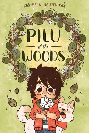 Nguyen’s debut full-length graphic novel follows Willow, a girl who runs into the woods and meets a tree spirit named Pilu. It’s about friendship but also about coping with grief and other big emotions (personified as monsters). It’s probably my favorite book of the year — not that I have to have just one. And not that the Caldecott is about favorites.
Before I even knew what a social-emotional powerhouse this book was, I fell in love with the muted coloring. The aesthetic of the book is deliciously earth-toned and handmade. There are so many leaves, so many trees, so many shades of green. Nature is the perfect setting for a book about processing emotions in (almost) solitude. The warm and cool colors also play a part in the cohesive emotionality of the book. The typefaces, which vary from the big cursive lettering of Willow’s memories to the bold-lettered sounds of nature and animals, further enhance the personal nature of the book. “Appropriateness of style of illustration to the story, theme or concept”? Check.
Beyond stylistic flair and appropriateness, Nguyen also taps into her child audience with the inclusion of the monsters. They are depicted as watery, gray, amorphous blobs — ambiguous yet specific enough to feel like characters. Sometimes the monsters are contained in glass jars; sometimes they’re contained only by a panel with a solid black background. Other times, they appear behind or beside Willow when she’s feeling extra sad or angry. They function perfectly as a visual shortcut to Willow’s inside thoughts that don’t rely on words to be made known (though the words are often there, too). Other design features also work to clue readers into Willow’s internal monologue: the panels become rounded when Willow interacts with the monsters in her head; Willow’s memories of her mom adopt a sepia tone. It all adds up to a carefully constructed marvel of sequential art.
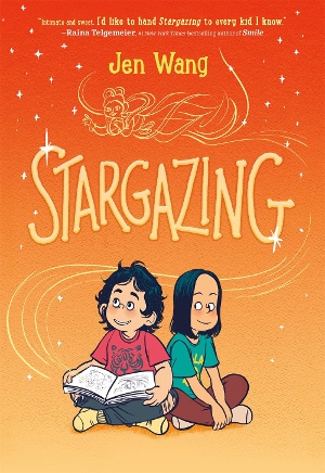 Stargazing by Jen Wang
Wang’s first foray into middle grade is a slightly weepy, odd-couple story infused with K-pop. In other words, it’s the best. Due to financial struggles, Moon and her mother move near Christine’s family. Moon tells Christine that her true home is in the stars with celestial beings, who sometimes appear to her through visions. Some medical stuff happens, testing the limits of their friendship. It’s poignant, funny, and, most importantly, beautifully rendered.
I wrote this last year about The Prince and the Dressmaker, but it bears repeating: Wang has a real gift for silence. With her immaculate panel placement, the storytelling has an easy flow that directs the eye where to look. But it goes beyond the panels, as the characters often break out of them or, in some cases, interact with them.
The first time Christine sees Moon, for example, Christine is depicted sitting atop a panel and gazing at the reader. In the panel below, Moon is shown in profile, within the panel. Overlaid onto the panel, a second depiction of Moon breaks her out of the panel so that she gazes at the reader, too. Not only does this effectively move Moon into the reader’s focus but it also uses Christine’s gaze to show us that Moon is somehow strange or different. Though the words provide context, the meaning can be gleaned solely from facial expressions and body language. It’s brilliant.
In Stargazing, the line work is thin but not too precise. Lark Pien’s coloring adds a softness to the story. The panels become characters unto themselves, almost like a Greek chorus. The Caldecott criteria asks us to consider “delineation of plot, theme, characters, setting, mood or information through the pictures,” and I think Stargazing combines artistic elements to convey it all.
Two books; two chances to flip the script. I suppose (thinking of This One Summer), graphic novels aren’t completely snubbed like board books or other formats. But I’m ready for more Caldecott gold and silver on the comics shelves. (And K-pop, of course.)

Added To Cart
RELATED


RECOMMENDED
Please register with us to continue reading.
ALREADY A SUBSCRIBER? LOG IN
We are currently offering this content for free. Sign up now to activate your personal profile, where you can save articles for future viewing.
ALREADY A SUBSCRIBER? LOG IN
Thank you for visiting.
We’ve noticed you are using a private browser. To continue, please log in or create an account.

Add Comment :-
Be the first reader to comment.
Comment Policy:
Comment should not be empty !!!