

2018 School Spending Survey Report

CaldeComics 2021, Part One
Every year the ALA Youth Media Awards roll around, and every year I’m a touch disappointed not to see more graphic novels among the various award selections. So when Jerry Craft’s New Kid won the Newbery Medal earlier this year, I was positively elated—bouncing up and down at 6:00 am PST, almost knocking over my tea, and definitely pestering my neighbors. The Newbery proper! Not an honor book, like Roller Girl or El Deafo. Oh, it was a dreamy, satisfying win for graphic novel enthusiasts everywhere. But what about that elusive Caldecott Medal?
Today on Calling Caldecott, Niki Marion writes about three 2020 graphic novels. She will contribute a second graphic novel round-up post later this week. —J.D.
Every year the ALA Youth Media Awards roll around, and every year I’m a touch disappointed not to see more graphic novels among the various award selections. So when Jerry Craft’s New Kid won the Newbery Medal earlier this year, I was positively elated—bouncing up and down at 6:00 am PST, almost knocking over my tea, and definitely pestering my neighbors. The Newbery proper! Not an honor book, like Roller Girl or El Deafo. Oh, it was a dreamy, satisfying win for graphic novel enthusiasts everywhere. But what about that elusive Caldecott Medal?
Because my colleague Alec Chunn is serving on the 2021 Caldecott Committee, I’m taking up his tradition of highlighting some of the graphic novels published this year that deserve Caldecott attention.
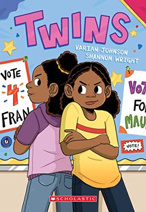 Twins by Varian Johnson, illustrated by Shannon Wright
This is Varian Johnson’s foray into graphic novel scripting, and his writing feels amazingly easy and natural. I think this is so mainly because of Shannon Wright’s talent for articulating the often-elusive subtleties of preteen emotion soup. Such pubescent feelings can only be the star of the show in a book about twin sisters starting middle school, and growing up and apart. Wright absolutely nails the twins’ ever-shifting anxieties and respective resentments, as well as their moments of joy.
The book opens on Maureen and Francine’s first day of school, as they sit in their dad’s car, waiting to pull up to the front of the school: Maureen in the backseat clutching her schedule with a furrowed brow and emitting squiggly worry lines and Fran in the front seat with an impatient slump, ready to get out of the car and dive into middle school.
I love the ensuing panel sequence so much for Wright’s compositional expertise. As the sisters get out of the car, Fran’s position always reflects her eagerness to jump into the next page: she’s in the top right corner with a big grin, throwing on her book bag; she’s doffing her hat (with her hand and forearm guarding her against the gutter) and winking as her dad kisses her goodbye; she’s serenely staring into the bottom right corner, reflected back at the viewers by the passenger’s side car window, encouraging us to turn the darn page already to see what’s on the other side.
Alternately, Maureen is not ready for middle school. To the left of Fran, she nervously packs her bag, directly facing the gutter; somberly accepts a kiss on the head from her dad, as she turns away from the right hand edge of the page; reluctantly waves as she follows Fran to school (and the inevitable page turn), though blocked by the car’s window frame. This sequence has no dialogue or narration, but Wright’s design of each twin’s body language and expressions easily demonstrates the differences in their personalities, which serve as the main conflict throughout the novel.
Even in smaller panels where Wright’s style becomes more manga-inspired (noses disappear and eyes and mouths simplify into fewer lines), her fine-tuned facial expressions remain precise and evocative. Even a single well-placed cheek smush conveys so much. Wright’s talents don’t end at the micro level, either; her use of full bleed images on pages with panels fluidly establishes setting and creates an immediate coziness that welcomes the viewer into the narrative.
Shannon Wright absolutely deserves Caldecott consideration for Twins, and a win would be historic—for, as Megan Dowd Lambert mentions in her post about Nina Crews’ A Girl Like Me, no Black woman has ever received a Caldecott Medal.
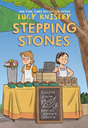 Stepping Stones, written and illustrated by Lucy Knisley
I’ve loved to see Lucy Knisley’s growth as a comic artist and visual storyteller. From her early graphic travelogues to her experiences with pregnancy and now her first middle-grade graphic novel, Knisley’s artistic strength lies in translating the relatable and humanizing events in her own life onto the page. While Stepping Stones follows the fictional Jen as she moves from the city to the country with her mom and her new boyfriend, Knisley includes an author’s note that details her similar experiences in childhood.
With this in mind, I was immediately intrigued by the book’s full title page, which is a photograph of a spiral bound notebook. The title is hand-lettered and, underneath it, reads “By Lucy Knisley.” In the top left corner, however, is “Jen McInnes”—the full name of the protagonist. This notebook goes on to serve as a visual motif throughout the story, placing viewers firmly in Jen’s viewpoint. She’s a budding artist, and viewers see her use this notebook to process her emotions, reminisce, and vent.
The notebook appears in many different ways: it functions as each chapter heading; its internal pencil drawings on lined paper sometimes replace Knisley’s full color panels within the visual narrative; and it also shows up graphically rendered in Knisley’s style. Viewers see the different iterations of the notebook and know that Jen is adding important context and perspective. This notebook illustrates Jen’s ownership of the narrative and, in turn, offers young viewers the opportunity to recognize their own ability to be the authors of their own stories.
Knisley’s choice of color palette works perfectly to reflect narrative mood: lots of earth tones and sun-faded hues in the rustic countryside where Jen now lives. Layered washes around a certain character subtly draw the viewer’s eye to a reaction or state of mind. And when the background color occasionally and dramatically shifts from forest green to a rich orange or warm yellow, viewers can clearly note Jen’s heightened emotions—not just frustration, but worry, relief, and even accomplishment.
Along with other strategic elements (a sparing use of jaggy-edged speech bubbles during arguments), Knisley creates a cohesive portrait of Jen, whose own artistic perspective displays the delicate balance of peace and chaos on a farm and in a family.
The Magic Fish, written and illustrated by Trung Le Nguyen
When I think of my favorite debut in children’s literature from this year, I can only picture this graphic novel. Nguyen has created a visual feast, a poignant intergenerational journey, and a love letter to the crosscultural ubiquity and relevance of fairy tales, all of which exists in one breathtaking package.
Nyugen’s art style is immediately recognizable and wholly unique. Reminiscent of Walter Crane, his detailed ink drawings are flat but exceptionally dynamic. His characters’ hair and clothing flow and whirl to guide viewers’ eyes in beautifu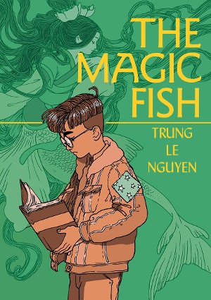 lly calculated arcs. These features also extend to the speech bubbles, whose curving, connected tails at once modulate composition and draw the viewer's eye across the page. To manipulate his art’s two-dimensionality further, Nguyen layers panels and superimposes characters over other elements, always adding in a breath of negative space where necessary.
As these curving lines guide the eye across the page, Nguyen’s use of color expertly orients viewers in the many intersecting storylines. Shades of pink indicate the main narrative, the world of Tiến and his mother, father, and friends; purple reveals the fictional world of the fairytales that Tiến and his mother Hiền read aloud; and yellow positions viewers in the past, and mostly in the Vietnam of Hiền’s past. With seamless transitions between each color-coded narrative, Nguyen lends a patchwork quality to his work—particularly apt since Tiến wears a jacket that his seamstress mother has patched for him numerous times with a star-spangled fabric. This is but one example of the multifaceted impact of each of Nguyen’s artistic methods; another is his inclusion of what I’ll call starlight.
Starlight has much significance: a scatter of stars emerges around a character or object, much like motion lines, to denote creativity, magic, potent emotions, and more. Starlight visually links characters on a page, provides transitions between panels, and even thematically joins the different narratives. In its first appearance in the narrative, starlight highlights an integral line from Hiền: “Fairytales...can change, almost like costumes. At work, I’ve rented out medieval outfits, space suits, and even animal costumes to different productions of Hamlet. I imagine the script stays the same, but the context always shifts.” Many of Nguyen’s visual techniques, including starlight, support the simultaneous mutability and connectivity of stories, and this concept also resounds in the heartfelt conclusion of Tiến’s narrative.
Taken as a whole, The Magic Fish feels like a quilt, lovingly stitched with painstaking care, and indeed Nguyen impressively drew the first two-thirds of the book by hand. I cannot wait to see what he’ll create next.
These are just three graphic novels that I hope the Caldecott committee will consider this year, and there are many more worthy contenders. I don’t know if we’ll see a CaldeComic win the coveted medal this year, but New Kid’s Newbery win has dared me to dream big.

Added To Cart
RELATED


RECOMMENDED
Please register with us to continue reading.
ALREADY A SUBSCRIBER? LOG IN
We are currently offering this content for free. Sign up now to activate your personal profile, where you can save articles for future viewing.
ALREADY A SUBSCRIBER? LOG IN
Thank you for visiting.
We’ve noticed you are using a private browser. To continue, please log in or create an account.

Add Comment :-
Comment Policy:
Comment should not be empty !!!
Allison Khoury
Thanks for this - ordered the 2 I hadn't seen while reading this excellent review.
Posted : Oct 27, 2020 06:05