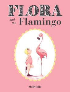
Here's a wordless book with flaps from Chronicle Books, which is one of those good publishers outside the mainstream NYC publisher location.
 Here's a wordless book with flaps from Chronicle Books, which is one of those good publishers outside the mainstream NYC publisher location.
Molly Idle's Flora and the Flamingo keeps things simple with lots and lots of white space and a limited (mostly pink, yellow, and soft black) palette. The plot is simple: girl sees flamingo, girl tries to imitate flamingo's balletic poses, flamingo smacks girl down, girl's persistence wins flamingo over, girl and flamingo -- now friends -- dance a pas de deux.
Idle's delicate watercolors (with some pencil for outlines and shading) show a somewhat stylized flamingo with super-thin legs and neck. Flora wears a pink bathing suit, yellow bathing cap, and black flippers. She is also on the chubby side, which somehow makes her balletic movements more endearing.
The design and pacing of this book, spread by spread, is superb. The story starts on the title spread, with the flamingo making a graceful landing into the book. On the next spread we see the flamingo standing on one leg on the left page while Flora's flipper-clad foot enters the scene on the far edge of the right page. Then we see Flora imitating the flamingo and quickly changing her position when the flamingo turns to look at her. Every three spreads, the next position of both girl and bird is revealed through flaps. Here's where I have a question. Why the flaps? Is it because there were more scenes in the story than a regular 32-page picture book could accommodate? Or is it because the flaps allow us to see the characters one at a time, first the flamingo and then Flora? But don't we already look at characters one at a time in a book like this? I'd be curious to hear your comments on the flaps, pro and con.
I love the way these characters are drawn. Idle's style here reminds me of Julie Vivas, who can do no wrong, IMO. I also like how Idle softens all that white space with some pink cherry blossoms across the top of each spread, and even incorporates a fallen blossom into the story. But I'm not sure how I feel about her choice to show the main characters at different sizes near the end of the book. After all those pages establishing change only through position, we suddenly see three sets of Flora and flamingo, smaller, and getting larger before a huge gatefold flap showing them extra large. Up until then, I was enjoying the restrained sameness of each spread -- the musical equivalent of Ravel's "Bolero." This made the book something different and interesting. Adding the larger scale strikes me as a capitulation to the norm: audiences prefer a good crescendo before the denouement. To me, staying with the characters at the same size would have been more daring. But that would also have made this a quieter book, and quiet books don't usually win awards. I wonder whether that crescendo near the end is what has put this book on various mock Caldecott lists. What do you think?

RECOMMENDED
ALREADY A SUBSCRIBER? LOG IN
We are currently offering this content for free. Sign up now to activate your personal profile, where you can save articles for future viewing.


Add Comment :-
Comment Policy:
Comment should not be empty !!!
Sara Ralph
Flaps are a nightmare for elementary school librarians, but I think this would make a good gift for my daughter. I wish there were two versions of this book!Posted : Oct 29, 2013 04:37
Victoria Stapleton
LOLLY!!!!!! Now all is right with the world.Posted : Oct 29, 2013 01:49
Leda
Lolly, welcome back!! We've missed you!Posted : Oct 28, 2013 07:05
Martha V. Parravano
For me the flaps allow the action to be extended (literally doubled) and provide most of the humor--and there is a lot of humor!Posted : Oct 28, 2013 05:58
Elissa Gershowitz
I love, love, love the flaps. They extend the humor and add motion; lifting each flap more than once per page keeps that ersatz peek-a-boo game going for as along as a kid finds it funny (which can be quite a long time!).Posted : Oct 28, 2013 05:02