


2018 School Spending Survey Report

H Is for Harlem
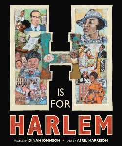
In April Harrison's H Is for Harlem (written by Dinah Johnson), the artwork is a feast for the eyes. One almost does not know where to look first, as each page is filled to capacity with the energy and vibrancy of the book’s subject.
[Many Calling Caldecott posts this season will begin with the Horn Book Magazine review of the featured book, followed by the post's author's critique.]
 H Is for Harlem
by Dinah Johnson; illus. by April Harrison
Primary Ottaviano/Little, Brown 48 pp. g
7/22 978-0-316-32237-9 $18.99
This engaging and beautiful alphabet book features and celebrates not only Harlem’s history, including the Harlem Renaissance, but also contemporary figures and iconic places that bridge Harlem’s past and present. From the Apollo Theater, Harlem Children’s Zone, and The Brownies’ Book to food, sports, and the arts, there is something here to spark any of a wide range of interests. Equal parts love letter and travelogue, this book is a virtual trip through the sights and sounds of one of New York City’s most iconic neighborhoods. Harrison’s (What Is Given from the Heart, rev. 1/19) vibrant paint and collage illustrations are equally adept at representing the historical and the contemporary. Every inviting spread is alive in color, detail, and respect for the subject matter. This book is a starting point to learn more about one of the most important artistic, cultural, and intellectual incubators of Black culture in the United States. What a splendid way to learn the alphabet! MONIQUE HARRIS
From the July/August 2022 issue of The Horn Book Magazine.
“H is for Harlem. Harlem is a place like no other in the world. The Lenape, a Native American people, were the first to live here and to honor this land they called Muscota.”
Alphabet books are a staple of children’s literature and can be found on any number of topics, often only read for the benefit of very young children. H Is for Harlem is a rare exception.
The artwork in fine artist and illustrator April Harrison’s paint and collage illustrations is a feast for the eyes. One almost does not know where to look first, as each page is filled to capacity with the energy and vibrancy of the book’s subject. Harrison is the perfect artist to apply her hand at representing both the historic and the contemporary. Every spread is alive in color, detail, and care for the subject at hand and invites the reader to take in every face and location that adorns the pages. There are literal and figurative layers to this book as the text invites us to consider layers of people, place, and time. The artwork helps us consider those things in terms of art, cultural references, and the mediums that construct the work itself. Paint, pen, and collage work are harnessed in a powerful way to depict Harlem as a place that is yet becoming, despite the gentrification and displacement of Black people. H Is for Harlem, through text and illustrations, communicates the deep roots of Black Americans who made Harlem the rich social, political, arts and culture hub that it is today.
These illustrations do more than symbolize; they transport. For someone who has never been to Harlem, the artwork is as realistic as it is whimsical, stirring curiosity and desire to inhabit the places featured. The people are also an important feature of the art, as the detail denotes a level of devotion not only to the famous, such as the double-page spread featuring riveting portraits of Malcolm X and his family, but also the everyday people who make Harlem great. The "H is for Harlem" spread depicts faces floating above the brownstones of Harlem, where its many stoops have served as gathering places, places of community.
The portraits of the people are a veritable rainbow of skin hues, demanding the reader to look and look deeply at the humans who have contributed to Harlem’s glorious past and evolving future. The M spread portrays the Studio Museum of Harlem and the artwork shown alongside Black people enjoying it — children’s upturned faces gazing alongside an elder in composed contemplation of a Betye Saar sculpture, again a pointed reminder that Harlem’s best days are ahead.
The use of color is noteworthy as well. Harrison’s use of the mediums of paint and collage are exquisitely executed on every page, with carefully constructed palettes that veer from almost monotone, such as the D spread for the Dance Theater of Harlem. With soft pinks, blues, and mauve tones set behind brown skin tones. The page communicates beauty and softness. The vivacity on the page is enhanced by the textures added in the collage, weaving a seamless, gorgeous portrait of humanity and movement. The A spread for the Apollo Theater and the A train feels riotous in comparison, with bold reds, yellows, and greens against a highly textural background that at once competes with and complements the people and places depicted in the spread, depicting joy and movement.
(For more on the creation of H Is for Harlem, see the publisher's Book Chat with the Illustrator: Featuring April Harrison)

Added To Cart
RELATED


RECOMMENDED
Please register with us to continue reading.
ALREADY A SUBSCRIBER? LOG IN
We are currently offering this content for free. Sign up now to activate your personal profile, where you can save articles for future viewing.
ALREADY A SUBSCRIBER? LOG IN
Thank you for visiting.
We’ve noticed you are using a private browser. To continue, please log in or create an account.

Add Comment :-
Be the first reader to comment.
Comment Policy:
Comment should not be empty !!!