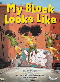
Frank Morrison's background as a breakdancer and graffiti artist is evident in his illustrations for My Block Looks Like, "Janelle Harper’s joyful ode to city life into a story about what a child experiences on their way to a dance audition."
 Illustrator Frank Morrison began his career as an artist breakdancing and creating graffiti art. These influences are evident in his illustrations for My Block Looks Like, in which he turns Janelle Harper’s joyful ode to city life into a story about what a child experiences on their way to a dance audition. Street art influences Morrison’s palette, his lines and angles, and the exquisite lettering of the graffiti we see in his backdrops. Echoing the theme of Harper’s words, Morrison gives us the delight of urban dwellers going about their business and coming upon a burst of vibrant shape and color — an assertion of life — on things like a dreary building and a delivery truck that have seen better days. These paintings speak of someone familiar with cement, brick, and pavement.
This art is filtered through a dancer’s eyes — the main character’s and also the illustrator’s. The book is a kinesthetic experience from the front jacket image of three children jumping — eyes closed and arms pumping — to the back jacket image of our main character sauntering, shoulders thrown back, blowing a gum bubble. The point of view of the artist and reader shifts often on page turns: straight on, above, below, angled. This is where I see the eyes of Morrison as a breakdancer, flipping, jumping, turning. The denouement of the book happens, appropriately, in a dance studio with a full spread of three elegant dancers on tiptoe, enraptured in their art, echoing the front cover image. In the bio on his web site, Morrison cites Ernie Barnes and Annie Lee as influences, and that influence is evident in the characters’ lean and elongated legs, arms, and torsos. It’s also evident in the focus on Black lives, urban landscapes, and movement. Morrison’s movement is his own, though. There is melancholy in Barnes’ and Lee’s work. Morrison’s images are radiant — bursting, pouncing, alive.
To cite the Caldecott criteria, I’m making a case for excellence of pictorial interpretation, delineation of plot and theme, and distinction of the art. Now I want to focus on excellence of technique.
Morrison is a master painter. Please go watch this Instagram video of Morrison adding highlights to a girl’s locs. It’s the touch that transforms (look at how her face lights up!), and these touches are everywhere in this book. Let’s focus on the spread that accompanies “chilling on the stoop / a gathering of brilliant minds.” Here we see a group of kids absorbed in conversation. What I want you to focus on, though, is the draping of those children’s clothes. It’s a small detail, one Morrison could have left out, but there it is, beautiful and letting us know that the details of these children are worthy of attention. The artist’s care is a signal to the reader, and the technique is perfectly executed. The draping of God’s robes on the ceiling of the Sistine Chapel don’t look this good.
Books that receive Caldecott recognition don’t typically burst with joy. If we look at the few winners and honors by Black creators that have centered Black lives, we see even less unadulterated ebullience. That’s part of what makes this book distinctive. We don’t have piles of books showing us happy Black kids living in cities, even though there are a whole lot of happy Black kids living in cities. When you see a book with a subject that isn’t overdone that employs an artistic technique that is a perfect match for the theme by an artist whose technique is impeccable — that’s a Caldecott.
[Read The Horn Book Magazine review of My Block Looks Like]

RELATED
ALREADY A SUBSCRIBER? LOG IN
We are currently offering this content for free. Sign up now to activate your personal profile, where you can save articles for future viewing.


Add Comment :-
Comment Policy:
Comment should not be empty !!!