


2018 School Spending Survey Report
The Art of Visual Storytelling in Long-Form Nonfiction
In order to create compelling narratives without ever making anything up, authors of long-form narrative nonfiction employ such elements as setting, character, and plot development; specificity of detail; and dialogue, forming an intimate connection between research and craft. Book design is not generally in our purview (for a variety of reasons), but some of us are able to be fully engaged in what I call visual storytelling.
In order to create compelling narratives without ever making anything up, authors of long-form narrative nonfiction employ such elements as setting, character, and plot development; specificity of detail; and dialogue, forming an intimate connection between research and craft. Book design is not generally in our purview (for a variety of reasons), but some of us are able to be fully engaged in what I call visual storytelling.
I tend to think of a long-form nonfiction book as a complex jigsaw puzzle slowly taking shape in my mind, coming into greater focus, piece by piece, the more attuned to a topic I become. Right from the start, the visual storytelling factors into my thinking as integrally as the text. Although an author working with design can be rare in the publishing industry, I am not alone in this practice.
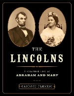
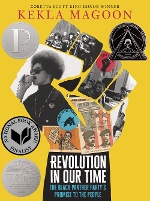
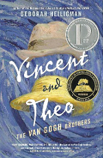
In order to engage in visual storytelling, an author needs a visual concept for a book. For her The Lincolns: A Scrapbook Look at Abraham and Mary, Candace Fleming said, “I had a ‘map’ for that design. I made a square for every photograph, where it belonged, what the headline should be on the page, how big it should be, etc., and married it to the narrative; it’s as important to the story as text.” Kekla Magoon’s first experience working this way was with Revolution in Our Time: The Black Panther Party’s Promise to the People. “I did the vast majority of the initial photo research myself. I met with the designer to have a conversation, and talked about trim size and what I was going for. I wanted to have something of visual interest on every spread and have it double as an adult coffee table book.” Deborah Heiligman told me, “With Vincent and Theo: The Van Gogh Brothers we talked about what the look of the book should be. I wanted it to have the feel of an artist’s sketchbook. Anna Booth, the designer, took that idea and ran with it.”
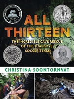
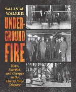 About her role in All Thirteen: The Incredible Cave Rescue of the Thai Boys’ Soccer Team, Christina Soontornvat said, “Because our team was on the same page that the visual elements (photos, illustrations, maps, etc.) would be an essential part of the storytelling, I was able to have a lot of input on the design, which I was so grateful for. I took several of the photos used in the book (during my research trip to Thailand), or I obtained permission to use the photos directly from the photographer…As with the text, our team went back and forth a lot on which images were needed, which to cut, edits to captions, etc. It was a very collaborative process.” Sally M. Walker offered something quite similar: “I have a lot of input in design…with Underground Fire: Hope, Sacrifice, and Courage in the Cherry Mine Disaster [reviewed on page 114], part of the action takes place underground and I talked with the designer about making it look like it’s underground, and so that chapter is bordered in black.” She also told me, “I’m 100% responsible for all photos.” Heiligman concurred: “I’m always involved in the photographs — I choose all of them.”
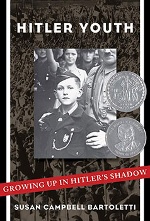
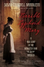 Ditto. 100%. I actually can’t imagine not being the person in charge of collecting and curating my images; after all, it’s my job to become the expert on a topic and, in so doing, discover the best visual materials to effectively tell a story. I also try to put myself in the shoes of readers who might not necessarily read every word, or those who might be mostly looking through a book, to help ensure everyone can gain a strong enough sense of the story. Susan Campbell Bartoletti, author of such books as Hitler Youth: Growing Up in Hitler’s Shadow and Terrible Typhoid Mary: A True Story of the Deadliest Cook in America, echoed this idea: “While some read for both text and images, others read just by the pictures, so the overall form and the captions are important for those reluctant readers.”
* * *
Nonfiction authors engaged in visual storytelling consider it a labor of love as it requires an enormous amount of additional time and tenacity, as well as excellent detective skills and a penchant for this method of storytelling. It also requires collaborative buy-in from our editors and designers. For instance, my editor at Candlewick, Hilary Van Dusen, says: “It is unusual for authors to be involved in the design of a book, but we trust Tanya to provide great ideas upfront and know that she will let the designer ‘do their thing’ with the input she has provided. We do not want authors art directing their own books, but Tanya knows how to navigate the balance of her ongoing involvement.”
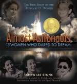
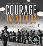
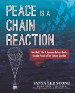
From the start of my narrative research, I begin searching for, collecting, and organizing images — usually over the course of a few years — as well as negotiating pricing and securing permissions. Once the book goes into production, my curation process kicks into high gear, as does my collaboration with the designer. While I acquired some of the basic skills needed during my first career as a children’s nonfiction editor, my art and craft of visual storytelling has evolved throughout my writing career, beginning with Almost Astronauts: 13 Women Who Dared to Dream, continuing with Courage Has No Color: The True Story of the Triple Nickles, America’s First Black Paratroopers, and in Peace Is a Chain Reaction: How World War II Japanese Balloon Bombs Brought People of Two Nations Together, which will be released in September [reviewed on page 113].
My focus on overlooked histories makes photo research especially challenging, as sexism and racism often relegate visual evidence to the shadows. NASA’s website, for example, made no mention of the Mercury 13 women profiled in Almost Astronauts until 2008, and still only includes one image. The National Archives houses a tiny collection of photographs of Black WWII soldiers, which does not contain any of the Triple Nickles men profiled in Courage Has No Color.
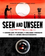 Peace Is a Chain Reaction presented similar challenges due to both the little-known and personal nature of the intertwined stories, and the need to provide contextual background of Japanese internment during WWII. In a meta example of the power of visual storytelling, I learned the War Relocation Authority (WRA) manipulated the harsh reality of this mass incarceration by hiring famed photographers Ansel Adams, Clem Albers, and Dorothea Lange to do their bidding and put a positive visual spin on things. Lange, however, chose to photograph the situation accurately — so the WRA buried her photographs for decades. Compounding the insidious, long-term damage of this stunt, the incarcerated were not allowed to bring their cameras, thus practically eliminating primary-source documentation of life in the internment centers. This brand of “unseen” discrimination agitates my visual storytelling brain. To help combat discrimination and restore some of this history for readers to gain a more accurate perspective, I used nine now-unclassified Dorothea Lange images and created a photo essay contrasting two Ansel Adams photographs with the work of incarcerated photographer Toyo Miyatake, thus also carving out space in the book to include some of his story — which includes smuggling in a camera lens and eventually being recognized for his expertise. (Don’t miss Elizabeth Partridge’s similarly themed new book Seen and Unseen, reviewed on page 111. Betsy is Lange’s goddaughter and an expert visual storyteller.)
Peace Is a Chain Reaction begins with the explosion of a Japanese balloon bomb in an Oregon forest during World War II, which killed five children and a pregnant woman. It widens to involve the families of those victims, a group of Japanese women who made the balloons during WWII, and a Japanese American man named Yuzuru Takeshita — who brought them all together in a thirty-plus-year relationship founded on peace and forgiveness. I wanted the book’s design to both bring some of the fascinating technical aspects of this history to life and deeply reflect the personal nature of the stories. I requested that the endpapers be made from an expert’s map of known balloon bomb sightings, provided a sketch for an illustration of how the balloons traveled across the jet stream, and included several declassified military images of balloon bombs. We created two back-to-back spreads, each featuring a full-page photo mirrored by a full-page technical diagram so readers could really nerd out on the apparatus details. I tracked down an elderly author in Japan who had written about her own childhood story and received permission to reprint a few of her unique illustrations.
I wrote brief vignette chapters to weave several narratives together throughout the book, interspersing them among the longer chapters, and requested that we set them apart visually with an illustrative feature. Illustrator Yumeno Furukawa created stunning abstract openers for them, and designer Rachel Wood further defined these vignettes with tinted pages. I also wrote more than twenty ancillary notes to extend the book’s text, asking Rachel to make them function like footnotes without looking like (dreaded) footnotes. She created an elegant arrow motif that directed readers’ attentions perfectly.
An author’s investment of time directly affects visual curation success. Time spent is generally rewarded, as finally finding images can feel like uncovering hidden jewels or buried treasure long forgotten in unlikely places, such as a shoebox at the back of a closet or dusty scrapbooks — one was even found stashed inside an old cereal box! Connecting with those intimately involved is also key. For Peace, I sought out family members through various means. I was about to give up securing any images for one important figure when I re-read her obituary, newly noticing the mention of a historical society. Maybe they could put me in touch with a relative? I soon found myself in a lengthy conversation with the deceased’s son, who was grateful for an opportunity to help me, spending several days locating images.
* * *
 Similar anecdotes lie behind dozens of images within the narrative nonfiction books of like-minded authors. For Fleming’s Murder Among Friends: How Leopold and Loeb Tried to Commit the Perfect Crime, she sussed out a photograph of Nathan Leopold taken when he was in prison, teaching other inmates to read. “Because it wasn’t taken during the trial, it wasn’t catalogued with the other material,” she told me. She discovered it while looking through the prison’s archives, “much to the surprise of one scholar.”
Time is also a critical ingredient. Over time I become so familiar with my topic that I can pick subjects out of a crowd, as I would with my own family. For example, as I scrolled through hundreds of unlabeled images in the National Archives, my eye stopped on three unidentified group photographs snapped during a 1943 graduation ceremony at the Topaz Relocation Center. I glimpsed Yuzuru Takeshita’s face in the group and sent the images to his daughter. She not only confirmed that it was indeed her father but also said that the family had never known these images existed, and were thrilled. (I also sent an email to the National Archives and Records Administration, NARA, so they could add this identifying information to the file.)
Managing these extensive visual resources required my creating an organizational spreadsheet that facilitates my collaboration with design. The spreadsheet catalogs the overall flow of imagery — which chapters have enough options, where the visual holes are, what images I still need to find — and allows easy tracking of each image’s status for source, permission, fee paid, credit line, high-resolution location, etc. The designer draws from this to create sample layouts, which include chapter openers, main spreads, and any features I included at manuscript stage such as sidebars or infographics. The editor and I then provide detailed critiques of these layouts to discuss with the designer.
What follows is my “keying of the manuscript” from the spreadsheet, noting where each image corresponds with text so design can create a first-pass layout of the entire book. Then we can really see which elements need my further input, such as pull-out quotes, chapter opener designs, or visual features like photo essays, as I often do not create them until I see how the book is flowing, and where I might utilize images in a unique way. We continue collaborating through dummy and galley phases, tweaking the visual story as we go.
I consider myself extremely fortunate to be offered the opportunity to take ownership of the visual curation of my books. This intimate collaboration wouldn’t be possible without generous, brilliant book designers and editors as we work in concert to weave narrative and visual storytelling layers together for readers to enjoy.
From the September/October 2022 issue of The Horn Book Magazine.


Added To Cart
RELATED


RECOMMENDED
Please register with us to continue reading.
ALREADY A SUBSCRIBER? LOG IN
We are currently offering this content for free. Sign up now to activate your personal profile, where you can save articles for future viewing.
ALREADY A SUBSCRIBER? LOG IN
Thank you for visiting.
We’ve noticed you are using a private browser. To continue, please log in or create an account.

Add Comment :-
Be the first reader to comment.
Comment Policy:
Comment should not be empty !!!