


2018 School Spending Survey Report
The Illustrator's Eye: Illustrating in Layers: The Wonder of Preseparation Art
Last summer I had the opportunity to visit the Kerlan Collection at the University of Minnesota, one of the largest archives housing materials related to children’s literature. Amid the sketches, dummies, early manuscripts and correspondences, and many other related paper ephemera and objects, what especially drew my interest was a sizable collection of the original preseparation layers created by picture book artists from the early 1900s through the 1970s.
Last summer I had the opportunity to visit the Kerlan Collection at the University of Minnesota, one of the largest archives housing materials related to children’s literature. Amid the sketches, dummies, early manuscripts and correspondences, and many other related paper ephemera and objects, what especially drew my interest was a sizable collection of the original preseparation layers created by picture book artists from the early 1900s through the 1970s.
To give a brief overview, the preseparation process maximized the limited capabilities of mid–twentieth century print technology, resulting in graphically bold images that were relatively cheap and affordable to produce. The artist was tasked with creating a separate layer for each of the color inks used, and when the layers were printed on top of one another, the full image materialized. This was an efficient way to create secondary colors rather than adding another ink into the mix.
Among these preseparations housed in the Kerlan Collection, I was excited to come across the work of Roger Duvoisin, whose illustrations I had long admired. The methods used to achieve his brilliant artwork had always been a source of fascination for me. Duvoisin was a true master at stretching a limited color palette by overlapping the inks he had available in order to produce a surprisingly wide spectrum of colors. The resulting art is wonderfully full of life, bursting with spontaneous energy. My visit to the Kerlan allowed me to finally get a firsthand glimpse of his process and see just how much careful planning went into achieving that deceptively effortless vivacity.
Duvoisin (1900–1980) was a prolific picture-book creator perhaps best known for his stories featuring animals, such as Petunia the goose and Veronica the hippopotamus. Born in Geneva, Switzerland, he moved to the U.S. in his twenties with his wife, writer Louise Fatio, with whom he collaborated on a successful series of picture books, beginning with The Happy Lion. Using bold, solid colors in combination with expressive line work, Duvoisin’s art immediately grabs the eye.
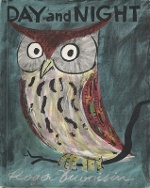 During my time at the Kerlan, I focused on his 1960 book Day and Night. The archived materials for this title allowed me to observe Duvoisin’s entire process, from his early typewritten drafts to storyboards, hand-drawn preseparation layers, and proofs of the printed pages. The black-and-white separations, created primarily with India ink on translucent sheets of plastic as the drawing surface, were beautiful in their own right. He mixed washes with crosshatching and stippling, line work with solid shapes, and sometimes scratched back into the inked areas. This resulted in a wide variety of textures and a sense of spontaneity.
Duvoisin also stood out for his innovative experimentation. In areas where he wanted a lighter version of a particular color, he would paste in minuscule dot patterns to create his own halftones. In the early stages of figuring out the colors and compositions, he planned out all the images in watercolor, painting rough full-color illustrations, and then appeared to work backward to reconstitute the images through the layering process. Being able to observe his entire bookmaking workflow was eye-opening and reminded me of my own journey into printmaking and my first encounter with Duvoisin’s work.
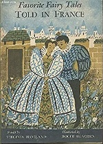 Back in 2010, when I was in art school studying illustration and trying to figure out how I could turn my passion for creating images into a career, I came across a slim volume at my local library that stopped me in my tracks. It was a book published in 1959 titled Favorite Fairy Tales Told in France, written by Virginia Haviland and illustrated by Duvoisin, with whom I was unfamiliar at the time. The illustrations were done in an expressive, free-flowing style, alternating between black-and-white images and ones in a limited colorway of ochre yellow, blue, and green. Although at first glance the art appeared simplistic and crude, there was a joyful energy that drew my eye and made me keep turning the pages. The images were graphically striking compositions that demonstrated an expert knowledge of color interaction. I was amazed at how, even with such a limited palette, the illustrations felt like they were not lacking in detail or color.
So began my fascination with production techniques used in mid-twentieth-century picture books. I knew I had to find out more and try creating illustrations using this method for myself. I didn’t have the proper vocabulary at the time, but what I had encountered was an example of preseparation artwork.
During my junior and senior years in art school, I signed up for every printmaking course I could fit into my schedule and spent the majority of my time in the printshop, cranking the litho press and pulling screen prints until my arms felt like jelly. I hand-separated the color layers using India ink and drawing on acetate, since transparency was required to transfer my designs onto the screen or plate, in essence creating a stencil that allowed my image to be transferred onto paper. Printmaking proved to be a revelatory experience. I found that breaking down the process of image-making into stages was a game changer. Instead of thinking about mixing colors together on a palette to put directly on a canvas, I could focus on the composition without the distraction of color, initially drawing everything in black and white. Then, once the elements were in place, I would start deciding which portion would be a specific color.
The moment I started working in this way, things seemed to fall into place. It felt like I was solving a visual puzzle, orchestrating all elements toward the goal of making a discernible image when they overlapped. The printed image always held surprises that I couldn’t have predicted, and it felt like a magic trick to see finished art revealed.
 Fast-forward to today — I have created five picture books to date, all of which incorporate some form of this color separation process. One of the biggest differences between myself and artists from the past is that I am working with this technique out of choice rather than being forced to use it due to production limitations. Print technology has made huge leaps since the 1950s and 1960s. These days, the majority of picture books are produced using the CMYK process, which stands for cyan, magenta, yellow, and key (black). This process allows for the full rainbow spectrum to be reproduced without the need for hand separations since the computer determines how best to distribute the colors to match the original scan of the painting or drawing. The four colors are printed onto the paper in a tiny dot pattern that is so fine that the individual dots are difficult to discern with the naked eye. This patterning is known as halftoning, and it is a more precise mechanized version of what Duvoisin was doing by hand. Today, at times the quality is so good that it can be hard to tell the original artwork and the reproduction apart.
Despite these advancements, I think there is something to be said for keeping alive the tradition of preseparation art. No doubt CMYK printing is wonderfully suited to reproduce paintings, collages, photographs, and drawings. However, with preseparations, the book itself becomes the original artwork, due to the image only coming into existence after it goes through the printing process. There is a brilliance to the colors and a tactility to the way the ink sits on the paper that creates a unique viewing experience. With careful planning, the results are just as stunning as a traditional handmade print one would see in a museum.
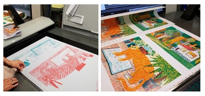
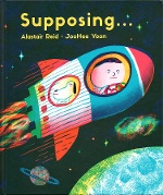
Yoon's preseparation illustration process for Supposing, written by Alistair Reid and illustrated by JooHee Yoon (2018).
Photos: JooHeeYoon.
My process has evolved over the years, and I no longer draw directly on acetate. But creating prints by hand and working in layers during my student days left a lasting impression on how I approach art-making. I learned to see mistakes as unforeseen possibilities and to consider limitations not as an obstacle but rather as an invitation to go down the path less traveled. Every new project is an experiment, where I work in a slightly different way that will allow me to gain a new understanding of the layering process.
I try to preserve that sense of spontaneous energy by creating as much of each layer as possible by hand on paper before scanning the drawings into the computer. Digital tools can be a great help because of the flexibility they provide in collaging different elements together with ease, and to preview what the finished illustration will look like in color before it is printed. However, sometimes this ability to fix every detail can backfire, since it allows for endless changes. It’s knowing when to stop that’s the important thing.
From the March/April 2023 issue of The Horn Book Magazine.

Added To Cart
RELATED


RECOMMENDED
Please register with us to continue reading.
ALREADY A SUBSCRIBER? LOG IN
We are currently offering this content for free. Sign up now to activate your personal profile, where you can save articles for future viewing.
ALREADY A SUBSCRIBER? LOG IN
Thank you for visiting.
We’ve noticed you are using a private browser. To continue, please log in or create an account.

Add Comment :-
Comment Policy:
Comment should not be empty !!!
Rachel Fremmer
I love your art AND Duvosin's!Posted : Dec 19, 2023 02:20