


2018 School Spending Survey Report

Unspeakable
The somber tone of the illustrations in Unspeakable: The Tulsa Race Massacre begins on the cover. For those of us in the children’s book community, the solemnity is also real as we contemplate the untimely death of Floyd Cooper, its award-winning illustrator. This incredible book was one of his last.
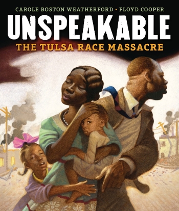 The somber tone of Floyd Cooper’s illustrations in Unspeakable: The Tulsa Race Massacre, written by Carole Boston Weatherford, begins on the cover. The family — mother, father, and two young girls — is obviously in distress as they appear to flee a scene of fire and destruction. For those of us in the children’s book community, the solemnity is also real as we contemplate the untimely death of Floyd Cooper, its award-winning illustrator — and Oklahoma native. This incredible book was one of his last.
Unspeakable is the story of the devastation of a once-thriving African American community, known as Greenwood, in Tulsa, Oklahoma. As the year 2021 marked the one-hundredth anniversary of the massacre, there have been many books and much media attention focused on the event and its aftermath. This picture book for younger readers is one of the best for introducing this difficult history to elementary-age students.
The beginning endpapers in sepia tones show blocks of a vibrant community, with figures going about their day. The style here creates a definite mood of the past as memory. Once we turn the title page and move into the story, the period automobile, design of the buildings, and placement of oil rigs support the text that places the narrative in another time. In one of the early spreads, we are drawn to a portrait of two girls, looking out at the reader. The choice to place them in the foreground indicates that they are important to this story. The protective arm of the older (taller) sibling reinforces their connection. The next few spreads depict the growth and prosperity of the community. The images are infused with light, and the color palette evokes optimism and expectation. It is worth noting that there is as much attention paid here to the achievements of the people of Greenwood as to its tragic destruction. That choice has the effect of emphasizing what was lost, in addition to the trauma. The dramatic spread with the incident that served as a catalyst for the massacre effectively uses darkness and light to signal a change in the direction of the story. The focus is now on confrontation and the attempts on the part of the African American community to defend itself. The positions of the people and the expressions on their faces enhance the storytelling. As the Black community is forced to flee from the White mob, the fluid drawings and vibrant colors provide a strong picture of what was endured.
The members of the Greenwood community are always at the center of the illustrations, to reinforce the idea of reclaiming a story that had been long forgotten as a part of American history. The last two spreads are bold portraits of rebuilding and commemoration that use light to end the narrative with hope. The illustrator’s note adds another poignant layer: Floyd Cooper writes of his family connection to the Tulsa race massacre, a story he describes as “deeply personal." The final endpapers are a historical photograph of Greenwood in ruins in the aftermath of the destructive violence — a sobering contrast to Cooper’s evocative drawing in the opening.
The primary aim in looking at this work is to consider how well it meets Caldecott criteria, such as:
- Excellence of execution in the artistic technique employed;
- Appropriateness of style of illustration to the story, theme, or concept;
- Delineation of plot, theme, characters, setting mood or information through the pictures;
- Excellence of presentation in recognition of a child audience.
Cooper’s subtractive style of “oil erasure” works extremely well in this story of neglected history. Anyone who witnessed him demonstrate his unique technique could not help but be astonished at his ability to coax images, with his eraser, from a paint-covered sheet. His signature color palette — of predominantly shades of brown with yellows and other pastels for emphasis — brings a sharp focus to the story, despite the softness of many of the images. When the narrative shifts to the attack on the Greenwood community, the illustrations are effective in creating the sense of urgency and danger the people experienced.
It is clear this is a story about resilience in the face of bigotry and violence, so the focus remains on those who endured. It is also clear that the impact is generational, hence the many images of children. The early spread of the family coming to Greenwood for new opportunity and the final spread of commemoration for those lost to racial violence speaks volumes about the African American experience. Cooper’s style evokes that emotional journey with artistic understanding, designed to resonate with a young audience. Despite the harrowing subject matter, the pictures are truthful without sensationalism.
This arresting and important work demonstrates a significant aspect of U.S. history. It also serves as one of the last examples of powerful illustrative storytelling from one of the field’s most prolific and talented children’s book creators. The high quality of Cooper’s pictures — and the way they enhance Weatherford’s clear and age-appropriate text, with insight and sensitivity for young people — make this a strong contender for Caldecott consideration.
[Read the Horn Book Magazine review of Unspeakable here.]
![]()

Added To Cart
RELATED


RECOMMENDED
Please register with us to continue reading.
ALREADY A SUBSCRIBER? LOG IN
We are currently offering this content for free. Sign up now to activate your personal profile, where you can save articles for future viewing.
ALREADY A SUBSCRIBER? LOG IN
Thank you for visiting.
We’ve noticed you are using a private browser. To continue, please log in or create an account.

Add Comment :-
Comment Policy:
Comment should not be empty !!!
Susan Dailey
To me there are several highly effective spreads in “Unspeakable.” One in particular--the pivotal scene with the elevator is ominous where it’s almost entirely dark except where the use of light focuses the reader’s eye on the young man and woman. And the shadow of the boy’s arm seems like a hand reaching out of the darkness to pull him in. Wow! And the back endpapers made me gasp! Somehow the use of a photograph made it even more real. Thank you for the wonderful review.Posted : Oct 01, 2021 02:54
Martha Parravano
So beautifully put, Ms. Taylor. About the cover -- whole essays could be written about the cover alone. The composition, the characters' body language, the facial expressions, the placement of the characters' hands... Obviously we all read different things into it, but I feel the father simultaneously trying to protect his family and look out for coming danger; the mother with her eyes closed, so sad, mourning, holding tight to her child; the little girl reaching her hand forward toward her father's hand while he reaches back for hers -- and then the small child, in the very center of the composition, staring directly out at the reader, daring anyone to look away and drawing us in at the same time. It's a remarkable achievement, that cover...
This book has already garnered so many accolades, from a Boston Globe-Horn Book Honor Award for Nonfiction to being named to the National Book Award longlist. I imagine -- and hope -- that it will earn many more well-deserved accolades.
Posted : Sep 23, 2021 06:54
Vicky Smith
"Cooper’s subtractive style of 'oil erasure' works extremely well in this story of neglected history." LOVE this. Everything about Cooper made him the perfect illustrator for this book.Posted : Sep 22, 2021 01:27