


2018 School Spending Survey Report
An Interview with Walter Lorraine
The multifaceted Walter Lorraine was a designer and art director at Houghton Mifflin before being named Director of Children’s Books, a position he held from 1965–1995.
The multifaceted Walter Lorraine was a designer and art director at Houghton Mifflin before being named Director of Children’s Books, a position he held from 1965–1995. He now heads his own imprint, Walter Lorraine Books.
Leonard S. Marcus: How did you get started in publishing?
Walter Lorraine: As a student at the Rhode Island School of Design in the early fifties, I studied graphic design. RISD offered an illustration course, though I did not take it. I did, however, take a special seminar given by Matlock Price, a former art director at some of the major magazines, and I became involved with the group that started Spectrum magazine at RISD. I worked on another magazine published at Brown University and did some freelance commercial work as well, including the first book I ever designed and illustrated — something called A Hundred Magic Tricks. These were the experiences that prepared me, to some extent, for work in book publishing.
Typography was what really intrigued me. The fifties, you must remember, was a time when the applied arts were riding high. It was the time of Container Corporation of America’s artistic advertising, the heyday of Saul Bass and Herbert Bayer and Paul Rand — all artists who worked primarily as advertising designers.
Before graduation, I had lined up a job at U.S. Steel, which at the time had a creative advertising staff. I felt very lucky. But then a job as designer/production manager of children’s books opened up at Houghton Mifflin, and three of us from RISD came up to Boston and interviewed. I didn’t think too much about it, but I was called back for a second interview, got the job, and decided to give it a try.
RISD placed the free exchange of ideas with one’s peers at the center of its philosophy of education, and my years there were a particularly exciting time because so many of the students were older, more experienced people who had come back from the war. It was because I thought I might have a better chance of continuing to enjoy that kind of exchange of ideas at a publishing house than at U.S. Steel that I chose to accept the Houghton Mifflin job.
When it came to typography and design, however, I was surprised to find that no one at Houghton seemed to know what I was talking about. We didn’t speak the same language. Fortunately, I was pretty much left to try out my ideas on my own, and I had good success at it.
LSM: What kinds of things did you do?
WL: There were certain purist Samuel Morrison kinds of rules in typography that one did not break. For Joice Mary Nan Kivell’s story collection, Tales of Christophilos (1954), illustrated by Panos Ghikas, for example, I used a lot of decorative letter-spacing of the lower case letters. That simply wasn’t done. Publishers Weekly, which at that time had an article on design at least once a month, singled out for praise several of the books I designed. So, as a young fellow just out of school, I was doing very well. I gradually got hooked on the challenge and complexity of books, and grew to love working in publishing. What I liked best was that you never solved the problem: every book had its own personality.
LSM: Who directed the children’s book department at Houghton Mifflin when you started there in 1952?
WL: Mary Silva hired me. She later became Mary Silva Cosgrave, and went on from Houghton to head the department at Pantheon in New York. Mary’s philosophy — and I think I adopted it in large measure — was that the most exciting and creative kind of publishing arises out of finding authors who have something to say, then making the publisher’s facilities available so that they can communicate to an audience. The alternative, which she rejected, was to deliberately construct or contrive books to fill some particular niche or need. I like to say that I have never published a book to fill a need.
LSM: One of the first major projects you worked on during the late fifties, though, was Houghton’s North Star series. Weren’t those books meant to compete with Random House’s highly successful Landmark Books?
WL: They were quite similar. There was in fact some dissension within the house as to whether it was appropriate for Houghton to be doing a commercial project of that kind. Houghton saw itself as doing artistic books.
The series obviously called for rather conservative artwork, but, even so, we changed the format completely from what Random House had done, and published the North Star volumes as two-color offset books. Landmark Books, which had started out with illustrations in black-and-white, later copied us in that regard.
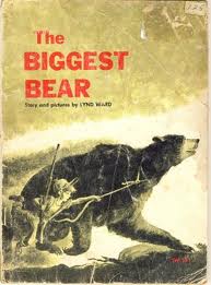 LSM: You came to Houghton just when Lynd Ward must have been completing The Biggest Bear, which went on to win the 1953 Caldecott Medal. Did you work with him on that book?
WL: Yes, I did. We had quite an argument over the selection of type, which is sans serif. I couldn’t see using sans serif for any book, especially for one with a story such as his, which was so warm and emotional. I argued that a sans serif type was too cold and unfeeling. But Lynd wanted it, felt it was more modern looking, and so it was used. I still think The Biggest Bear is a wonderful story, and I still don’t like the type!
LSM: How did you become interested in typography?
WL: My interest in typography grew out of my interest in the nature of perception, in understanding how people see. When you read, for example, you don’t see every letter. You see letters as groups, with focused stops across a line. Realizing this led me to think about what is readable in terms of typography and what isn’t readable. A larger type size is not necessarily more readable. We read ten- or eleven-point type far more readily than we read fourteen. That’s because with the smaller type sizes you can take in more at a glance. I developed theories of this kind and applied them in the design classes I taught at the Boston Museum School.
LSM: What kinds of exercises did you devise for your students?
WL: I gave them abstract design problems to encourage them to find ways of making graphic statements by means of an effective composition rather than by relying on content alone. One assignment was to start with a 4x4-inch square of space, then take three one-inch squares and arrange them to make various kinds of statements. I have always felt that the base of art lies in that sort of command of abstract forms and composition rather than in how clever you are with the brush.
Humans are essentially visual animals. The opposable thumb may have contributed to human development, but vision had more to do with it. And what is vision’s primary function? It’s a protective operation. The focal point is the point of greatest threat.
When we look at an image or scene, we have a tendency automatically to bring it into a comfortable structure. Studies have confirmed this. When shown a composition for a split second and then asked to draw what they saw, people tend, for instance, to straighten out the crooked lines, to produce a more stable design. So, on one level the satisfaction we derive from most good art work comes from the sense of organization that the artist has somehow imposed on, or found in, chaos. Ideas of that kind have always intrigued me.
LSM: Among the artists you inherited from your predecessors at Houghton was H. A. Rey. What was it like to work with him?
WL: I worked with him on the later Curious George books, on Find the Constellations (1954), and possibly one other. He was a brilliant man, and very well organized: Rey always knew exactly what he wanted to do. In his case, my job was simply to help him implement his ideas rather than to try to give direction.
There’s always a certain effect that may be hard to achieve. For example, the Curious George books were done as pre-separated art. Rey might want a hazy smoke cloud in the background, and the question would be how best to achieve that effect so that it fit in with, and did not overwhelm, the overall art concept.
LSM: Were there other aspects of Rey’s art career that are less well known than his children’s book art? Did he also paint?
 WL: I don’t know. But I did notice that his interest was more in the concept underlying an illustration or a book than in visual representation as such. In contrast, most painters approach painting as a strictly visual experience rather than as an intellectual one. Rey was more of an intellectual. Rey was amusing to talk to but he was essentially a very serious guy. He was concerned, for example, about social issues. During the Vietnam War, he wrote a letter to the New York Times to dispute the official government position that we were over there to save the South Vietnamese people, to give them a better life. Rey had done some arithmetic and found that with all the money our government had already spent on the war, we could have bought every Vietnamese person a villa on the Riviera. That was his way of offering a new perspective. Rey’s interest in astronomy also went quite deep. Find the Constellations and his book for adults on the same subject, The Stars: A New Way to See Them (1952), were based on an original concept of his that is still considered innovative.
LSM: Did his political views inform his children’s books?
WL: He did do a book about zebras called Zebrology (1937), which asked whether the zebra was white with black stripes or black with white ones. That book was a very early black-white racial statement. He would occasionally do things of that sort. But if there is a political or social comment in the Curious George books, it eludes me.
The Curious George books have enjoyed a level of popularity akin to that of Hershey’s chocolate and National Geographic. Generation after generation have passed them down. Kids love the books, though not so much because of the exceptional nature of the artwork or of the text. It has more to do with the concept: that a little monkey, or little child if you will, always gets in trouble, and that he never means to: he is just curious. And it isn’t that curiosity is a bad thing, either. George’s misadventures arise outside of his control. Kids are the same way. They often don’t understand what the heck they did that so irritated the adults around them. So George’s story is very satisfying to them.
LSM: As you continued to publish children’s books, and pursued a parallel career as an illustrator, did you develop any particular theories or ideas about illustration as an art form?
WL: I’ve often said that illustration is like architecture: there’s art in architecture, but architecture is not an art. It exists to serve a purpose beyond itself. That lesson was underlined for me around the time Houghton published Scott O’Dell’s Island of the Blue Dolphins (1960). I knew it was a terrific book, and I wanted to present it in an artistic fashion, and as I often did in those days, I thought to look outside the children’s book world for a cover artist. I knew a great many painters and commissioned the cover art from one named Jason Berger, who was associated with the abstract expressionist movement. He proceeded to do three wonderful paintings. But when I saw them, I realized they were expressions of Jason Berger rather than of Island of the Blue Dolphins. I couldn’t use any of them. I then commissioned Evaline Ness, whose work I had first seen in Seventeen, to illustrate the jacket.
LSM: As a young editor, were there certain colleagues in the field whom you especially admired?
WL: Margaret McElderry, certainly. At Harcourt, she was bringing in artists from abroad, for example Hans Fischer and André François, as well as publishing such artists as Antonio Frasconi and Paul Rand. I think she did an awful lot to loosen up the American picture book.
LSM: So, I think it is fair to say, did James Marshall. Is it true that when you first met him he came in to Houghton Mifflin not with a standard portfolio, but with some drawings he had doodled on a handful of napkins?
WL: Jim was such a storyteller! I think his grandmother died three times, always just when he realized he was going to be late in delivering artwork. No, actually, when he first came to Houghton, he was teaching high school. He was starving to death, and knew a woman who was a retired copyeditor with the house, who called me about him. Soon afterward Jim brought in some work. He had an idea for a book called What’s the Matter with Carruthers?, which we published in 1972. I could see that he didn’t know what he was doing as an illustrator, but also that he obviously was a talent to be developed. So I gave him a book to illustrate by Byrd Baylor called Plink, Plink, Plink (1971), about sounds in the night. It was an interesting first effort that allowed him some time to develop. The very next book he did was George and Martha (1972) — a timeless statement about human relationships. I think he is the most underrated writer of children’s books ever.
LSM: His drawings, for the George and Martha books, especially, have a naive quality but are also very elegant.
WL: Most kids from the age of three to six or seven are superb artists. They don’t fuss around with technique. They have an idea they are trying to express, and they use everything that’s them to get it across. Jim was that kind of artist. Another artist with whom I did a few books, Wallace Tripp, could do the best animal characterizations I have ever seen. One day when I was visiting him in New Hampshire, he announced: “I’ve been improving my painterly skills. I’m taking painting courses.” I thought, “Oh God, there’s another one down the drain!” I worried, that is, that he might get so distracted by a concern for technique that he would lose that wonderful expressiveness that was naturally his. “I want to show you some of my new paintings,” he said, and proceeded to bring out some very large canvases that had obviously taken a long time to do. The funny thing was, they looked just like his drawings! Exactly the same. From that I realized that expressiveness, not technique, was what really mattered to him. In that respect, he and Jim were just alike.
LSM: You spoke before of James Marshall as an underrated writer. Had he lived longer, do you suppose he might have written longer works, a novel possibly?
WL: He did write a novel, now no longer in print, called A Summer in the South, which Houghton published in 1977 and which Dell later reprinted in paperback. It was hysterically funny, a take-off on Grand Hotel, with an owl that was patterned after Agatha Christie.
LSM: Lois Lowry is the novelist with whom you are most closely identified as an editor. With your background in the visual arts, did you find it difficult to refocus some of your efforts on the editing of manuscripts such as hers?
 WL: Lois, as it turned out, had also worked in the visual arts, as a photographer. The photos on the jackets of both Number the Stars (1989) and The Giver (1993) are hers. She came to Houghton at a time when we were sending a letter a month to writers outside of the children’s book field whose work appealed to us, to see if they would write a book for us. Lois, whose short stories had been appearing in Redbook and other magazines, responded positively. We published her first book, A Summer to Die, which is about her sister dying of leukemia, in 1977. Her next book is going to be a memoir incorporating photographs from her youth as well as reflections on how she came to write her books.
LSM: What have you learned from your experiences as an editor of the written word?
WL: For one thing, that a good test of an author is to see how many pages of the first chapter it takes to get comfortable with his or her style. With Lois, you are into it in the first sentence. She has an inner ear for meter. The prose just flows.
LSM: How did you meet David Macaulay?
WL: David submitted a fairly conventional picture book to Houghton on gargoyles. We looked it over and talked about it. I could have published it, and it would have done all right. But in talking to David it became obvious that he didn’t care about gargoyles. What really interested him was cathedrals. So I suggested, “Why not do a book about them?” And so he went away, did some samples, and all you had to do was glance at them: they were perfect. That’s how Cathedral (1973), and David’s career, got started.
LSM: Cathedral was an unusual book for its time, was it not?
WL: Yes. With a trim size of nine by twelve, it was unusually large, in fact too large to fit on standard library shelves. That large format, combined with the fact that it was eighty pages long, made it an expensive book to produce. On top of that, all the artwork was in black-and-white, which should have made it, as a higher-priced picture book, harder to sell. With all these special problems to overcome, I tried to get some support from the sales folks. But they said: “We can’t sell that,” also pointing out that it was a hard book to categorize. We did in fact have that problem all through the book’s early life. Booksellers had trouble deciding where to put it: in the adult art book section, or with children’s picture books, or with children’s or adult general nonfiction? We eventually got tired of answering that question, and told booksellers to put it wherever they wanted. That arrangement worked quite well, and Cathedral took off right away.
The amount of information presented in Cathedral, and the clarity of the presentation, were, I think, unparalleled until then. Readers also were intrigued to watch the cathedral grow from spread to spread, almost as in time-lapse photography. And David made characters of the people who built the cathedral, which gave his narrative a human element: it wasn’t just a collection of cold facts. It was a unique concept, and was recognized as such.
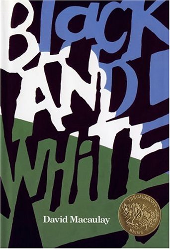 Many of David’s books have come from our wide-ranging general discussions. At one time, for example, we talked over a book idea that could be described as the story of a journey. We were speculating about how history worked, whether it was best thought of as a linear development or whether, for instance, it was more accurate to think of the unfolding of ideas and events over time as a series of explosions. We talked about things of this kind for about a year and a half — and it seemed that the more we talked, the more complicated the project became! But from those discussions emerged Why the Chicken Crossed the Road (1987) and Black and White (1990) and Shortcut (1995), all as pieces of the initial idea.
LSM: Have books by other authors developed from conversations like the ones you have just described?
WL: Yes — many. Bill Peet, who had worked for years as a story consultant at Disney, wanted to write a biography of Walt Disney. But Disney was a funny fellow. Bill had a sort of love/hate relationship with him. I suggested that instead he might want to write an autobiography that could incorporate some of the Disney material, and also be of interest as a book about growing up to become an artist. Bill Peet: An Autobiography was finally published in 1989.
Bill had trouble getting started as a picture-book artist during the 1950s because there was a prejudice among publishers, librarians, and critics of the time against Disney-style illustration, which was considered too cartoony and commercial. They thought it was cheap junk. It’s funny how attitudes of that sort change. Bill’s characterization of animals was so wonderful, and he had something to say. His heroes were always sort of alienated ugly duckling types.
LSM: Did David Macaulay introduce you to Chris Van Allsburg?
WL: That’s the conventional story — but no, he didn’t. I had seen some reproductions of artwork that Chris had shown, probably at the Allan Stone Gallery in New York. Among them were some large charcoal drawings, including one drawing in particular that intrigued the hell out of me. It was a picture of a young man in a sort of Victorian living room with a side table and lamp. The man was holding a stick over his head and there was a big lump under the rug. No one could look at that picture without feeling it was narrative. That is a characteristic of Chris’s work: you don’t focus to begin with on the composition, or the wonderful pattern in the rug, or the chiaroscuro lighting effects. You just think: what happened? Chris is really a narrative kind of guy — and he has a fresh vision. His sculpture has the same narrative quality: it’s less of a visual experience than a conceptual one.
LSM: Earlier you spoke of H. A. Rey’s approach to picture-book making in essentially the same terms. It would seem that, despite great differences in their style as illustrators, you see an underlying similarity between Van Allsburg’s books and Rey’s.
WL: Yes, exactly. After seeing those first pictures of Chris’s, I talked with him. He told me that he had his heart set on doing a series of pictures of topiary gardens. I told him, “Well you have to have a story and all that stuff” — so he went away and started to put together The Garden of Abdul Gasazi (1979). The only topiary reference appears on the jacket. That is a wonderful picture book, and a good example of what’s so interesting about the American picture book when it’s working right. It’s not an illustrated short story, as is the case with many European picture books. You need both the pictures and the text to understand the book’s statement.
 LSM: What accounts for the phenomenal popularity of The Polar Express (1985)?
WL: The Polar Express is a powerful story statement for a time when society needs a little faith, when everybody is looking for something to believe in. It has become a classic — a new Christmas tale. The loss of Santa Claus probably disturbs more people than would ever admit it. The boy being swept up and being in awe, and then being asked to choose a gift, and choosing a bell, which he can hear but most folks don’t: that sequence of images is the keystone of the story that brings it all together.
Similarly, in Allen Say’s Grandfather’s Journey (1993), the narrator’s statement that “the moment I am in one country, I am homesick for the other” serves as a keystone. It’s such a moving summation of the story’s emotions.
If you think of all the books that have been done about interracial and interethnic relationships, I think none have been as effective — without being obvious about it — as Allen’s. One of my favorite books of his is A River Dream (1988). It has Asian characterizations, but it is also about fishing, which Allen himself loves. The idea of that book is so powerful: that of the boy wanting to go out and become a great fisherman, and catching a big fish, and thinking, Boy, I can take this home and show all my friends — and then realizing that to do so he would first have to kill the fish, and deciding instead to throw the fish back. That’s a wonderful dilemma for a kid to have to face.
LSM: Of all the artists you have worked with, Susan Meddaugh would seem to have had the professional background most like your own.
WL: Well, she started in the production department at Houghton. But Susan always aspired to doing her own books, and so she left Houghton and went to New York. Then there came a time when I was without an art director, so I tracked her down and convinced her to come back. She became a tiptop art director and designer here for a number of years. No one was better at interpreting material. I would have gladly made her an editor. But finally she quit because she was so intent on doing her own books. She hit her stride with Tree of Birds (1990), and then the Martha books followed.
Most books these days are pure description; Susan’s are among the very few picture books being published now that have a strong narrative content. You can think about them, discuss them, go back to them and wonder what has occurred.
LSM: She also has such an offbeat sense of fun — as does Arthur Geisert. How did you come to work with him?
WL: A friend had seen a local art exhibition that included some etchings by Arthur, and told me about his work. I went to see the show myself and became intrigued by one picture that was somewhat narrative, in which a group of pigs were having an adventure in a balloon. I then got in touch with Arthur, and he sent me a series of related etchings, cut up in book form, and from that we developed his first book, Pa’s Balloon and Other Pig Tales (1984). His second book, Pigs from A to Z (1986), got Arthur going. By then I had worked out a way to maintain the etching feeling in reproduction with offset lithography.
Arthur’s getting better all the time, and his next book is going to be fabulous. After Haystack (1995), for which his wife Bonnie wrote the text, he proposed a book about a grain elevator. Arthur was very excited about this; he had gotten stuck on the top of a grain elevator once. I on the other hand was thinking, “Grain elevator. Woe is me!” But then we started talking about the town where the grain elevator is located and the nature of little Midwestern farm towns, what might typically happen in one of them during the course of a year. As a result of those conversations, the focus of the book shifted, and the title changed from Grain Elevator to Prairie Town (1998).
Arthur has incorporated a whole batch of stories within his pictures: a funeral, a wedding, a dog that lives and dies, and a house that burns down and is rebuilt. All of these storylines are included in the panorama of the artwork rather than in the text itself. It’s an ideal project for him — and it’s just thrilling for me to follow.
LSM: Let’s end with a few questions about the field as a whole. How has publishing changed during the time you have been at Houghton?
WL: I think it has gotten a lot more complicated. Early on, for example, I sometimes had a book in production before the contract was signed. These days, by contrast, you sweat over every last line in the boilerplate. That’s one indication of change. And these days there are so many different ways to reproduce material — CD-ROM, movie, licensed characters, book spin-offs and so on — the one potentially influencing all the others down the line.
LSM: What changes would you like to see?
WL: I would like to see the covers on books evolve a little bit. We still do covers more or less the way they were done in Gutenberg’s time, and they cost a bloody fortune. The average 32-page picture book costs between $2.00 and $2.10 to manufacture, of which the binding and cover account for ninety cents to a dollar — about half. That doesn’t sound like a lot in relation to the retail price, but when you break down all the costs, it is. People have experimented with plastic materials for bindings, but that kind of experimentation takes an awful lot of promotion and publicity in order to win acceptability in the marketplace.
LSM: Do you think that working in Boston rather than New York has influenced the kinds of books you have published, or your overall approach to publishing?
WL: I would say that being out of the give-and-take and hurly-burly of the center of all publishing in the United States, we’re freer with the ideas that we can put into books. We’re not so much of a go-along house as some publishers in New York are. It seems that New Yorkers, even though they deny it, are more incestuous when it comes to book ideas. In 1978, as president of the Children’s Book Council, I went to New York quite often, and found that the experience was starting to influence my editorial judgment in subtle and sometimes not so subtle ways. I’m far more comfortable being here and doing my own thing.
Presented with a series of etchings like Arthur’s, for example, most publishers would have cleaned them up so much that they wouldn’t look like etchings. After all, it sounds so impractical. “Hey, I’ve got this wonderful guy who does etchings, and you know what, he’s going to illustrate a book about pigs.” Take one of those very careful planners who now run most of the houses. Would they ever plan something like that? It sounds so crazy — but it works.
From the March/April 1998 issue of The Horn Book Magazine.: Special Issue: Picture Books.

Added To Cart
RELATED


RECOMMENDED
Please register with us to continue reading.
ALREADY A SUBSCRIBER? LOG IN
We are currently offering this content for free. Sign up now to activate your personal profile, where you can save articles for future viewing.
ALREADY A SUBSCRIBER? LOG IN
Thank you for visiting.
We’ve noticed you are using a private browser. To continue, please log in or create an account.

Add Comment :-
Be the first reader to comment.
Comment Policy:
Comment should not be empty !!!